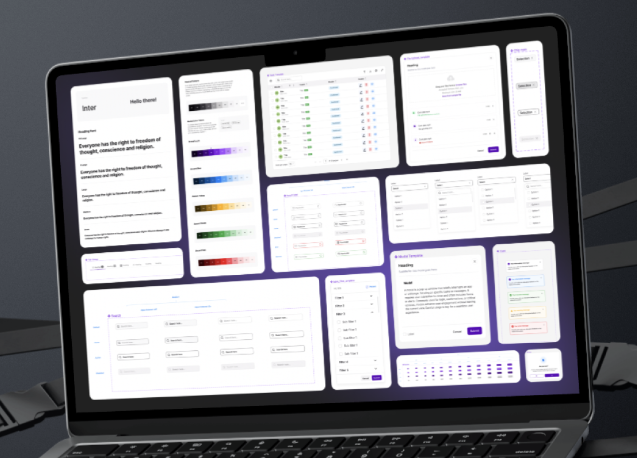
Design System
SaaS Design System
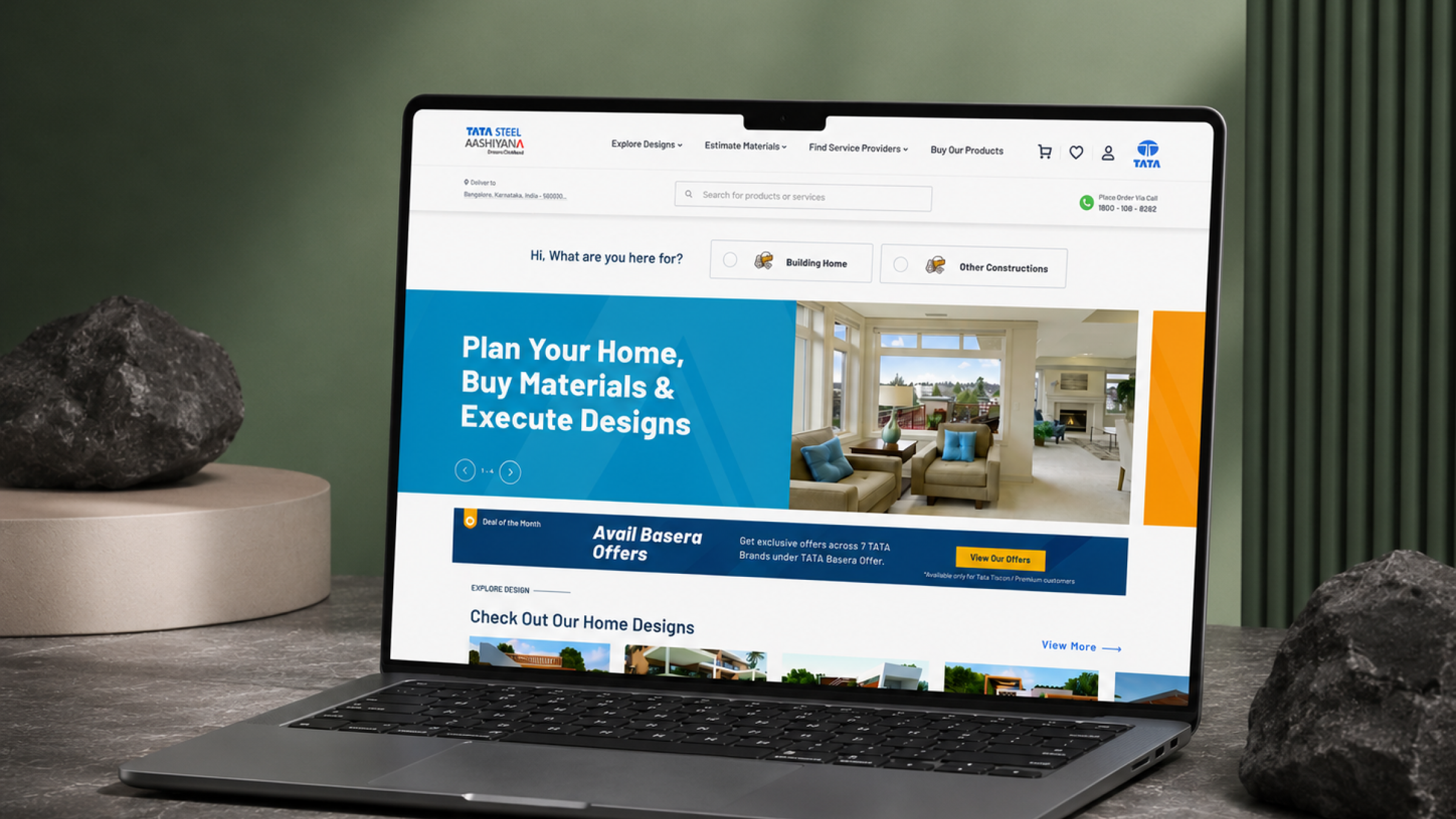
TATA STEEL Aashiyana is a digital platform built to simplify the home-building journey for homeowners across India — bringing inspiration, expert guidance, trusted professionals, and construction products together in a single, accessible destination.
The platform helps users explore house designs across styles and budgets, estimate material and construction costs, browse steel and building products, and connect with verified architects, contractors, and dealers — supporting them at every stage of planning and building a home.
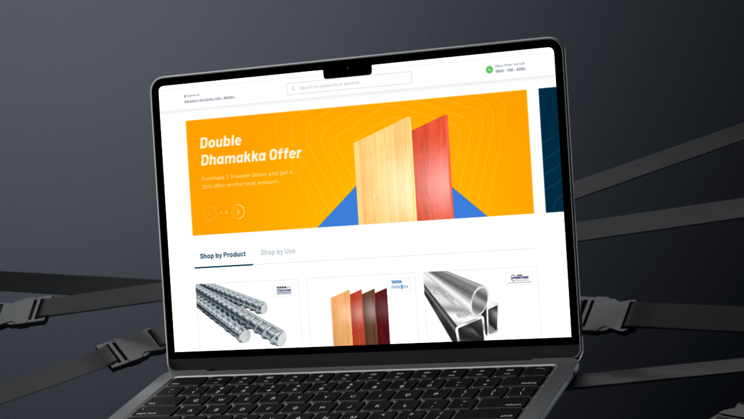
The major challenges included:
With so many user journeys to support, the process moved deliberately from understanding the business and its personas through to a validated, production-ready interface — rather than jumping straight to visual design.
1. Requirement gathering. Understood the business goals, target personas, and the breadth of products and services Aashiyana needed to support.
2. User flow planning. Mapped how different personas — homeowners, architects, and contractors — would move through the platform to reach their goals.
3. Information architecture. Structured the wide range of categories — products, services, house designs, brands, blogs, and calculators — into a navigable hierarchy.
4. Wireframing. Blocked out low-fidelity layouts to validate structure and content priority before visual design began.
5. UI design. Applied a modern visual language grounded in the TATA brand system across every screen.
6. Iterative design reviews. Refined screens through repeated rounds of stakeholder and team feedback.
7. Design validation. Tested flows and layouts against real user tasks before handoff.
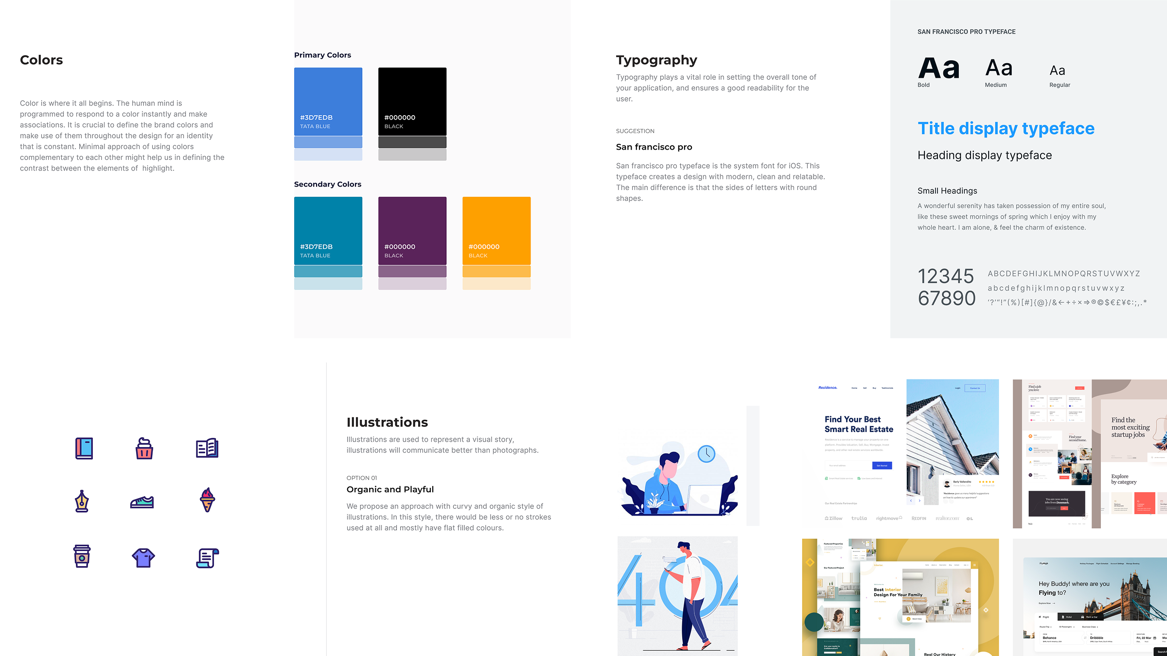
Visual direction was shaped early through a mood board pulling together colour palettes, typography, layout references, and branding cues — giving the team a shared visual language to design against before high-fidelity screens began.
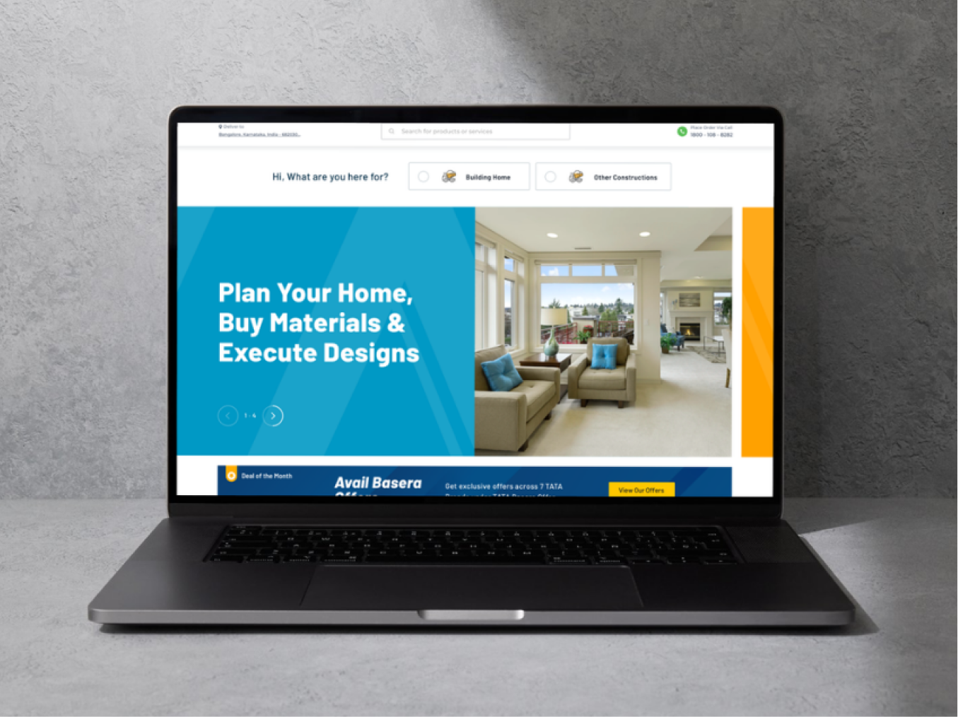
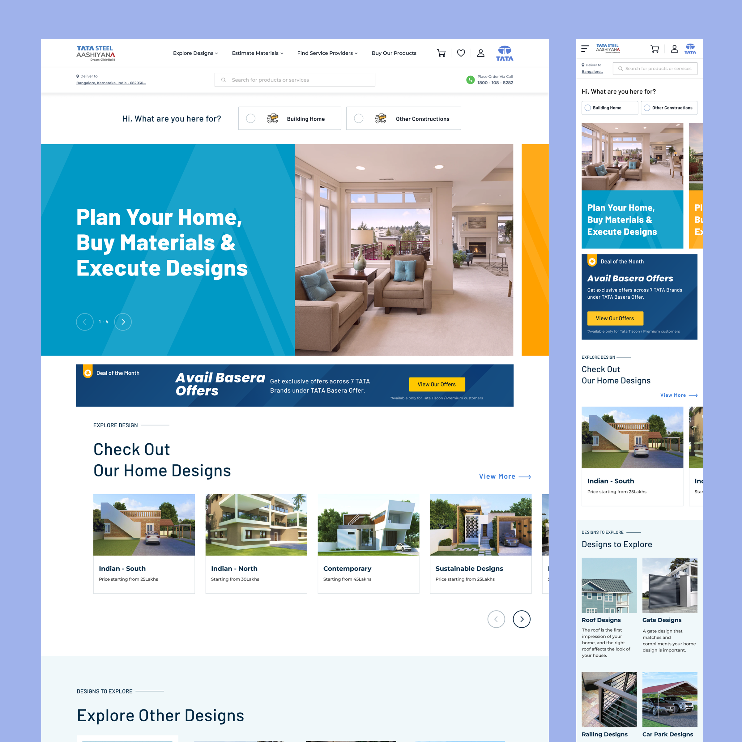
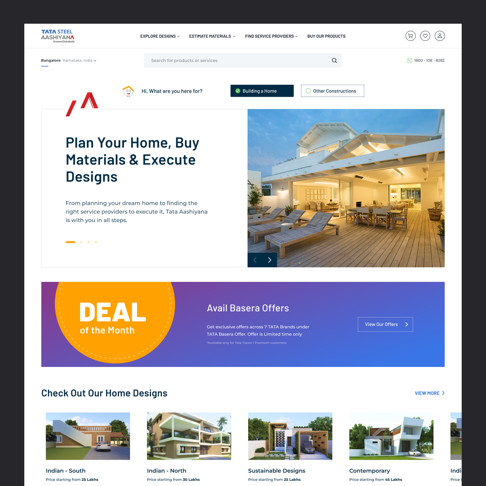
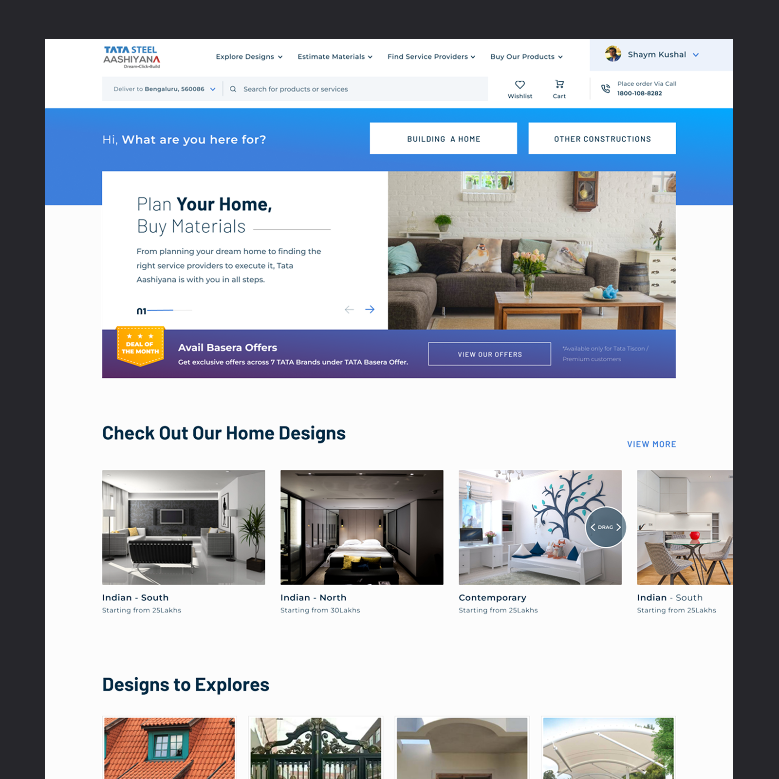
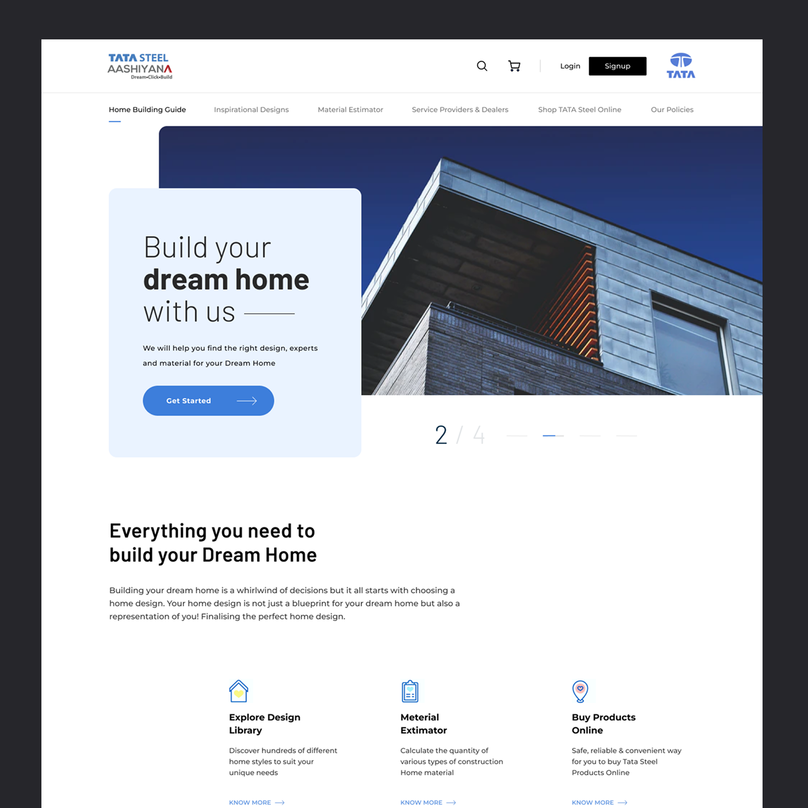
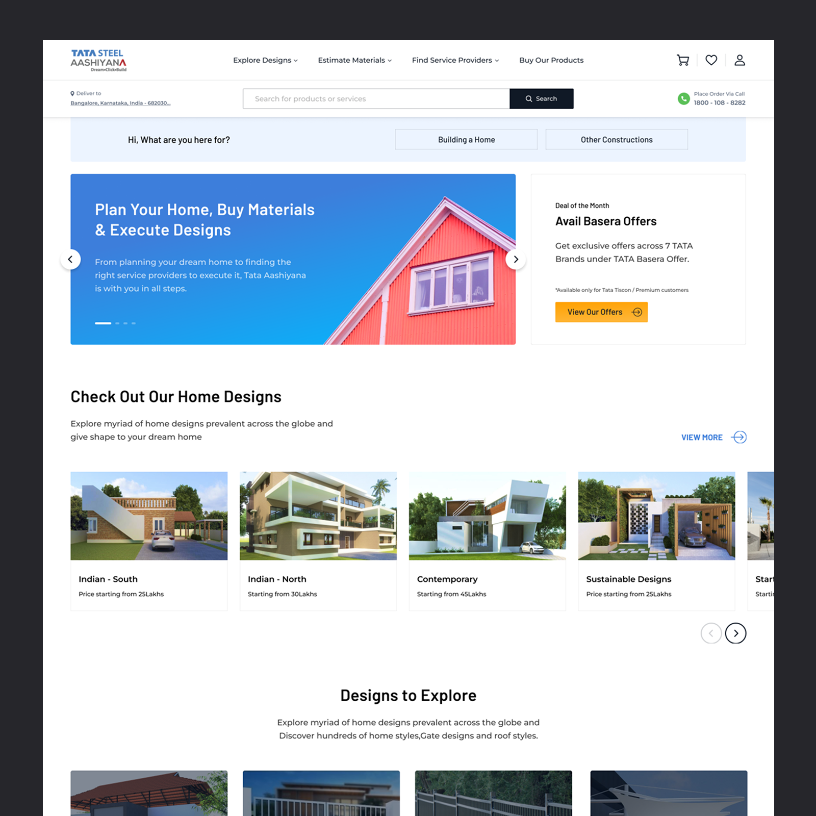
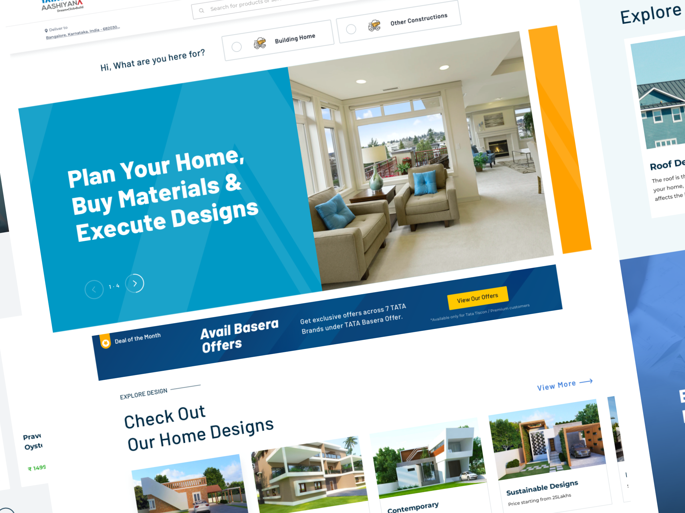
Before arriving at the final direction, we explored multiple homepage concepts — testing different ways to balance the TATA brand with the breadth of products, services, and inspiration Aashiyana needed to surface above the fold.
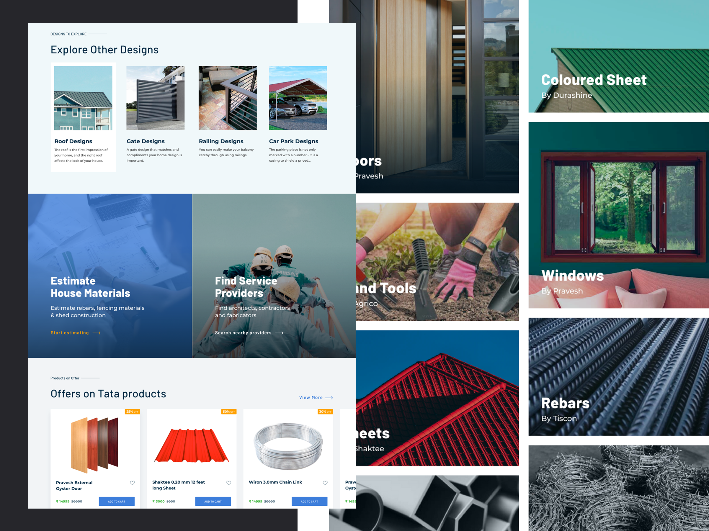
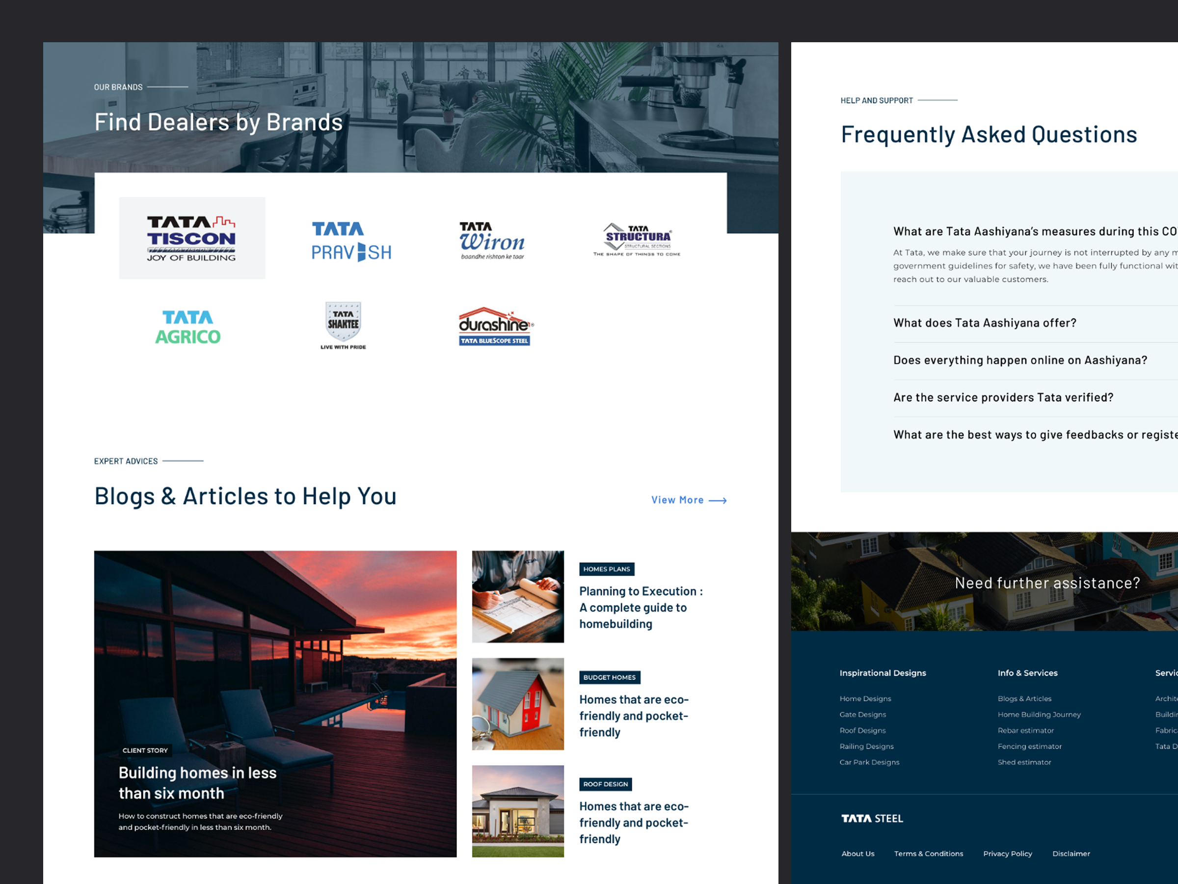
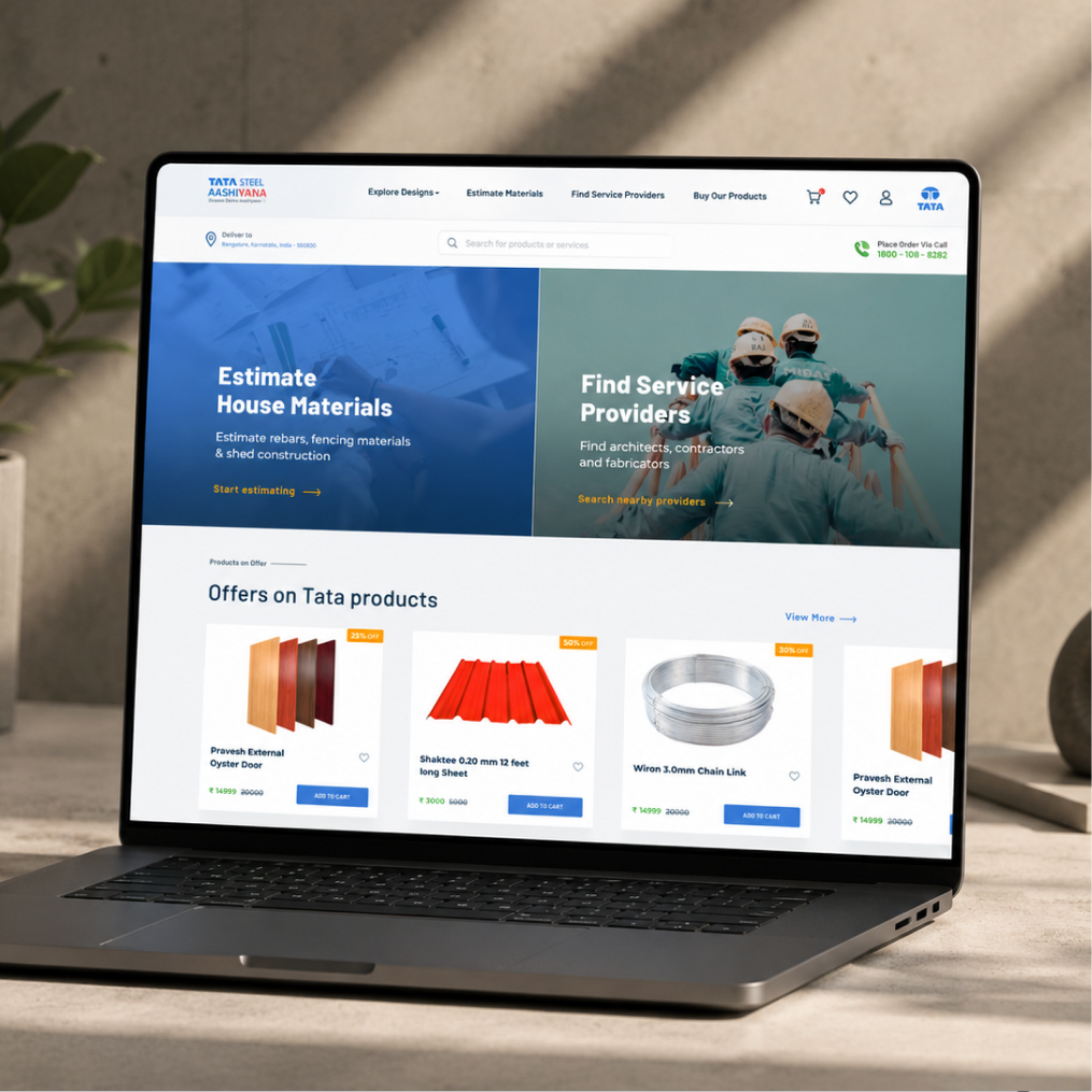
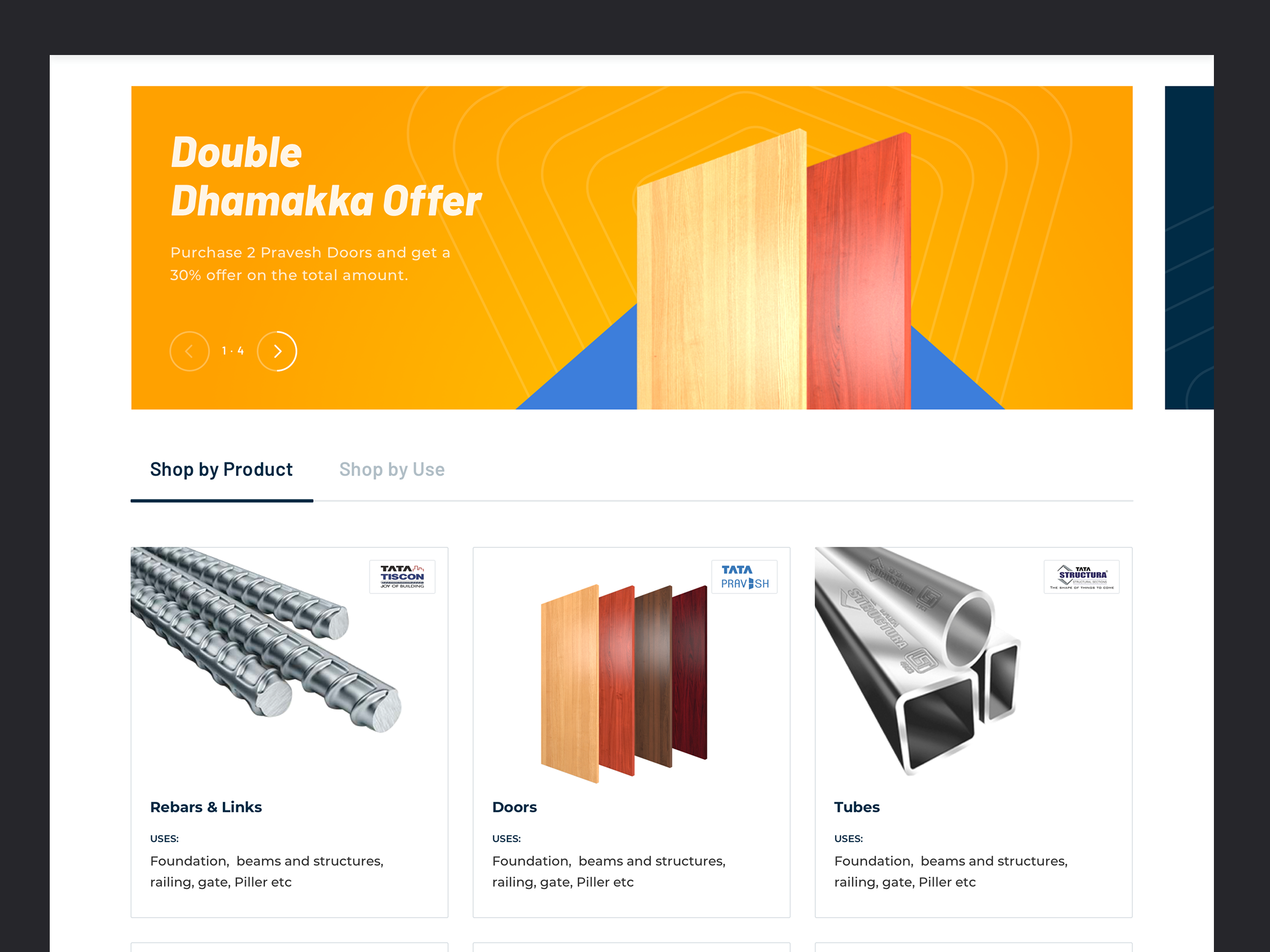
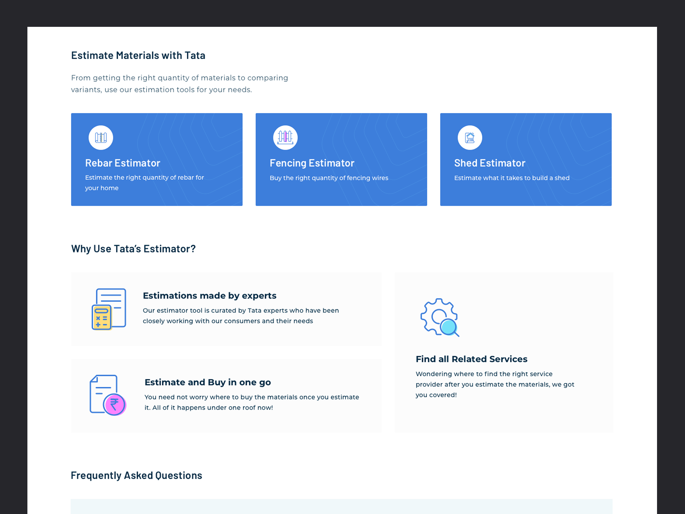
Beyond the homepage, Aashiyana spans a wide range of user journeys — from browsing and buying products to estimating materials and reading expert advice on the blog.
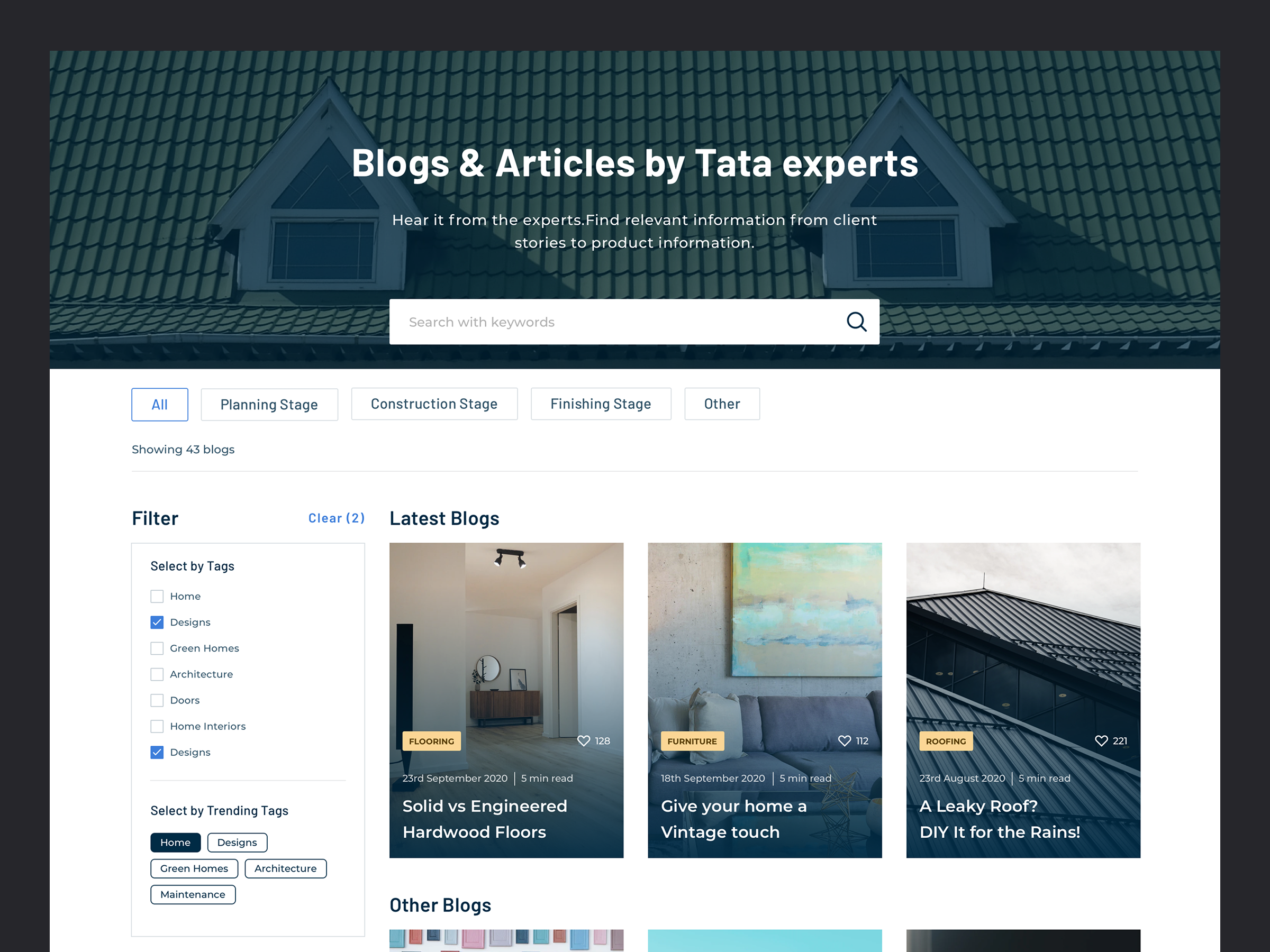
Modern, scalable interface. Successfully redesigned the platform with a modern and scalable user interface.
Improved discoverability. Products, services and home-building resources are easier to find and compare.
Consistent visual system. A visual language aligned with the TATA brand carried across every surface.
Fully responsive. Designs delivered consistently across multiple screen sizes.
Elevated user experience. A smoother experience for homeowners planning and managing their construction projects.
Thank you for exploring this work.