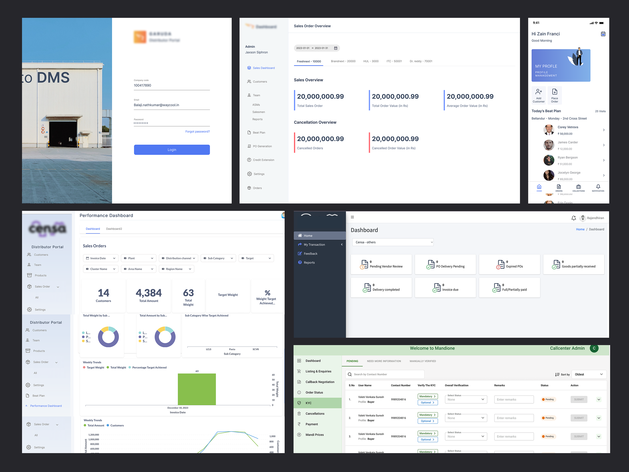
Secure Info runs a suite of SaaS products built for agri-supply chain operations — connecting the entire journey from farm to fork. Over several years, the product line had grown fast, but the design hadn't grown with it. Fourteen products, built by different teams at different times, each with its own visual language.
We were brought in to unify that fragmented experience: build a single design system from the ground up, and use it to reskin the entire product suite — against a short timeline, and without slowing the teams building on top of it.
Inconsistency wasn't just a visual problem, it was a velocity problem.
- No consistency across surfaces. Dashboards and mobile applications were designed independently of each other, with no shared foundation to keep them speaking the same visual language.
- No maintained style guide. Whatever documentation existed was outdated or incomplete, so it wasn't a reliable source of truth for anyone.
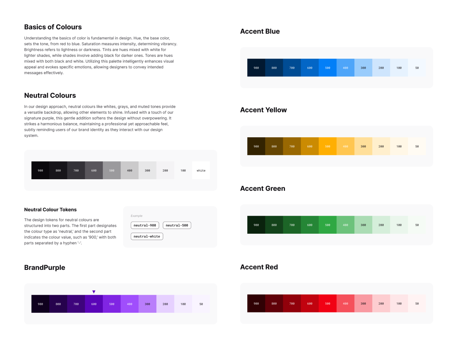
- Brand identity wasn't holding together. Core brand elements — colour and typography — weren't consistently applied, so the suite didn't read as one company.
- Every product had drifted on its own. Each of the 14 products had evolved its own styling, colour usage, and typography over time, with no shared system pulling them back in line.
- A tight runway. On top of all this, we had a short timeline to design, build, and ship the system — not just document it.
We treated this as infrastructure, not decoration. The system needed to hold up under real production pressure — not just look good in a style guide. And with a short timeline, we didn't have the luxury of building it in isolation before touching real product; design and revamp had to move together.
1. Design tokens first. Before touching a single component, we defined the core tokens — colour, typography, spacing, and grid — as the atomic layer everything else would inherit from. This meant any future rebrand or theme change could cascade through the system instead of triggering a redesign.
2. Built in parallel, in Figma and Storybook. The system was designed in Figma and shipped into Storybook at the same time, so design and engineering were always working off the same live source of truth instead of a static handoff document.
3. Pixel-perfect, auto-layout components. Every component was built using Figma auto-layout with defined variants, so components could resize, restack, and adapt to real data without breaking. Nothing was a static mockup — everything was production-ready.
4. Revamp alongside the build, not after it. Given the compressed timeline, we started reskinning existing products as the system took shape, rather than waiting for a "final" version. This let us stress-test components against real screens early and catch gaps before they became rework.
5. Build with designers, not just for them. We rolled the library out incrementally, gathered feedback from the teams actually using it, and iterated. Documentation and update cycles were built in from the start, so the system stays alive rather than going stale the week after launch.
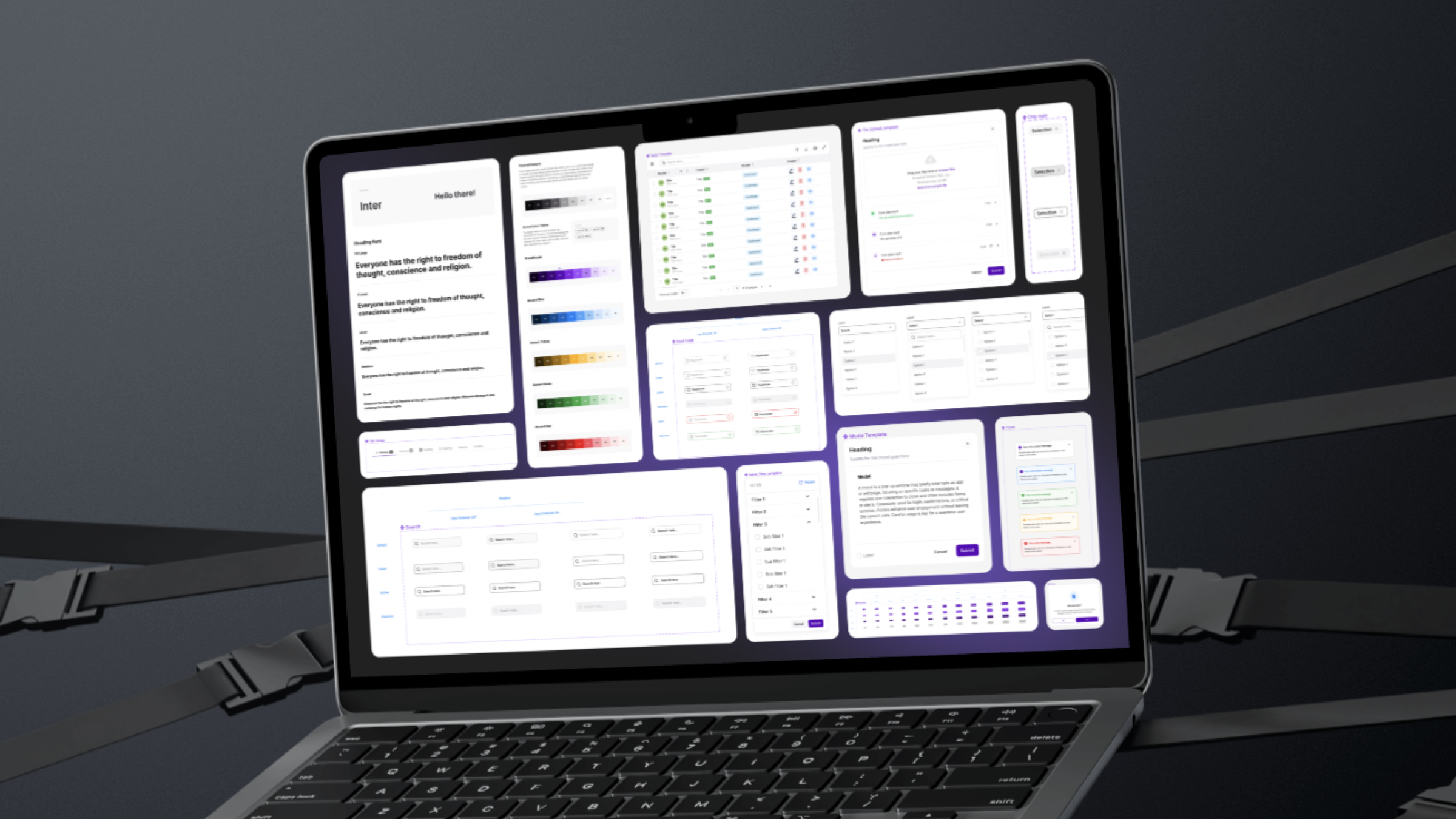
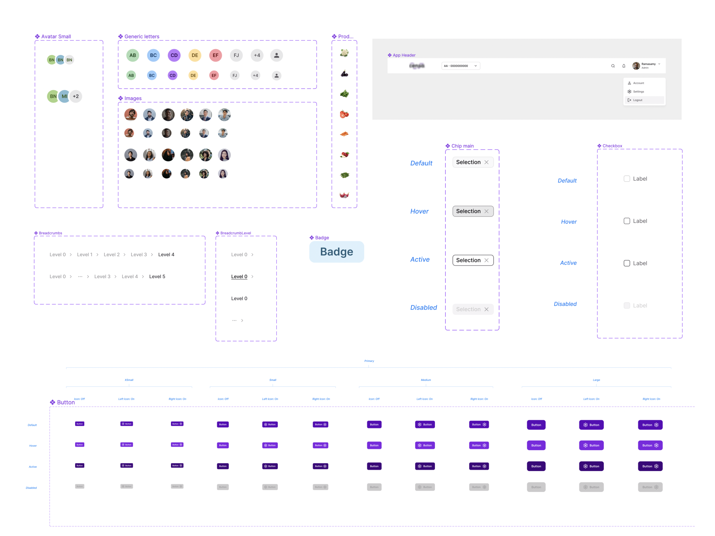
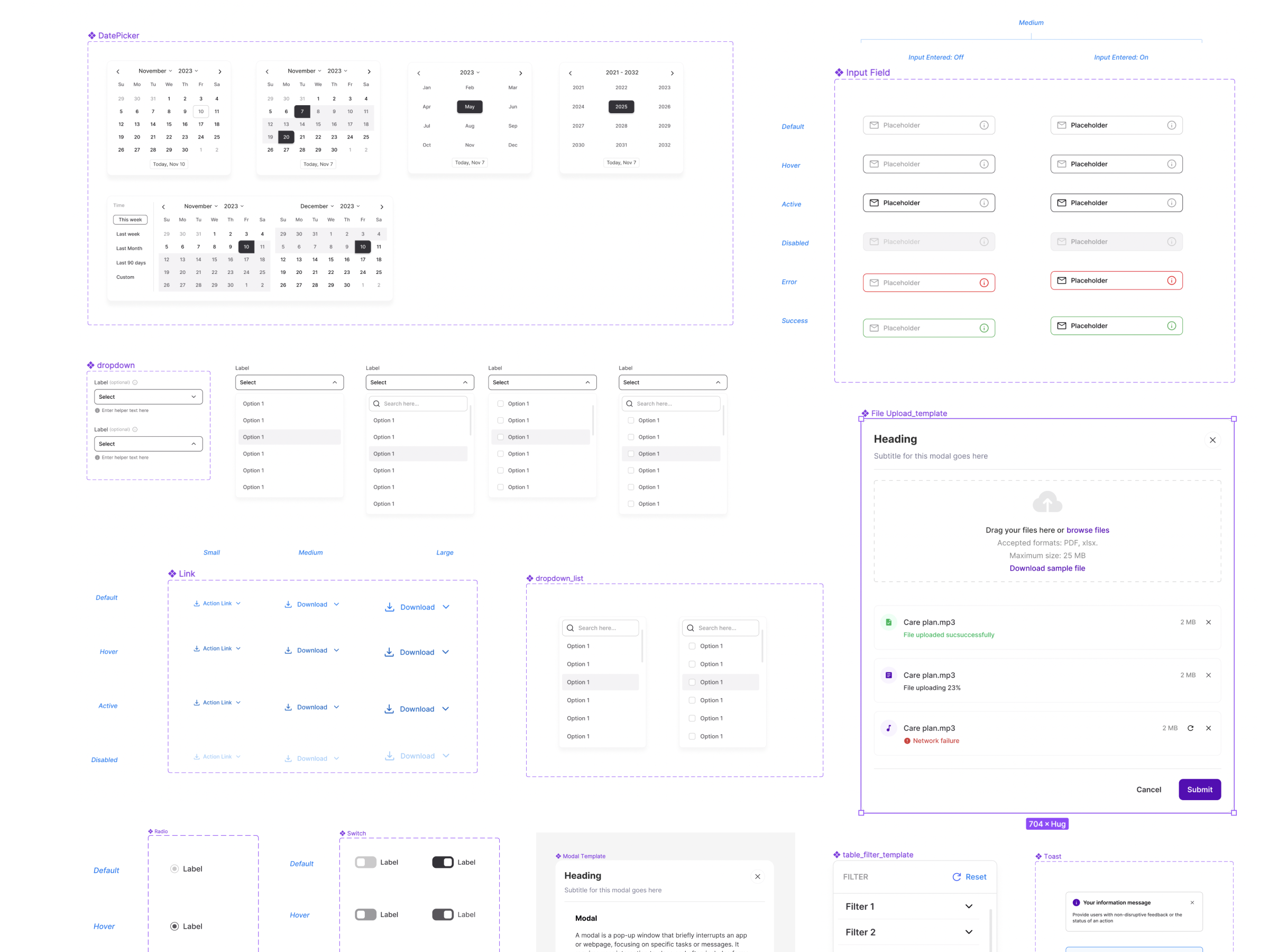
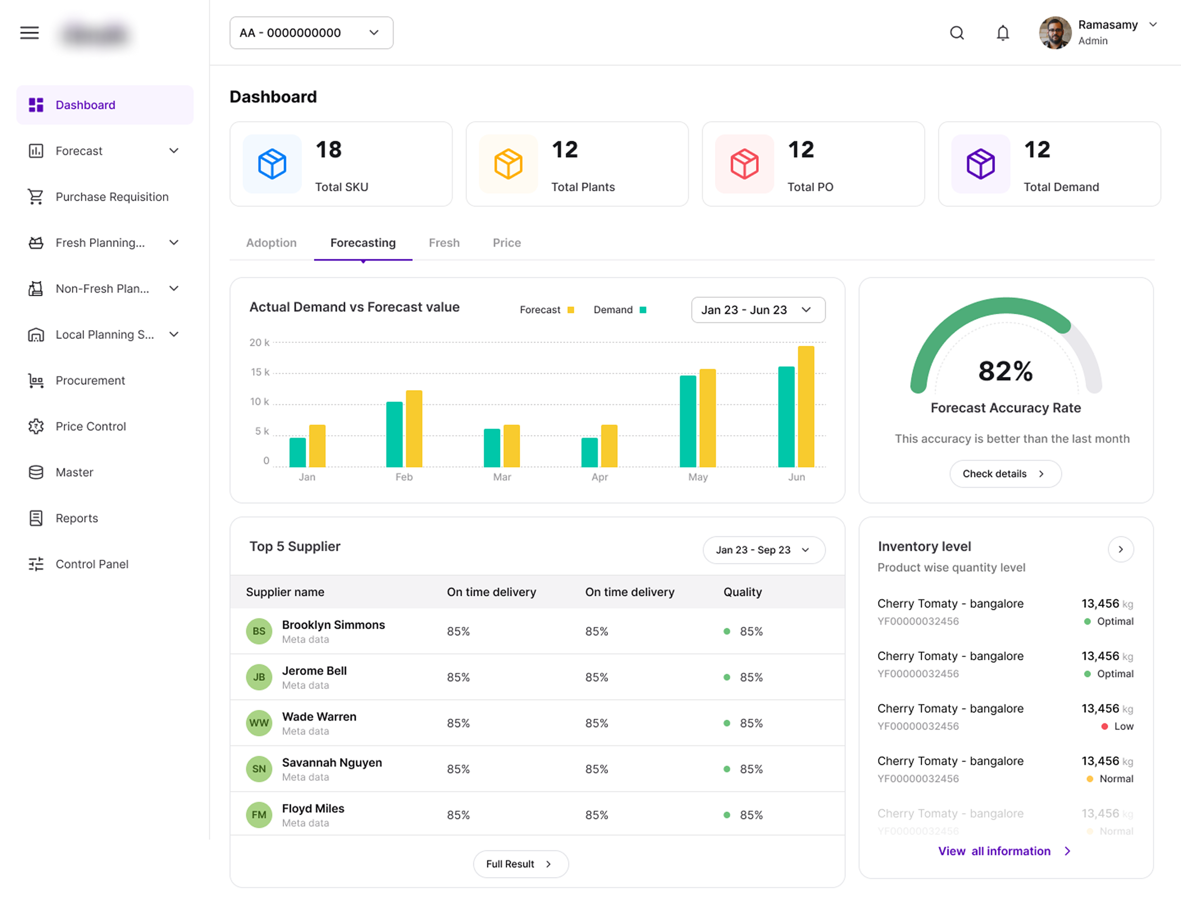
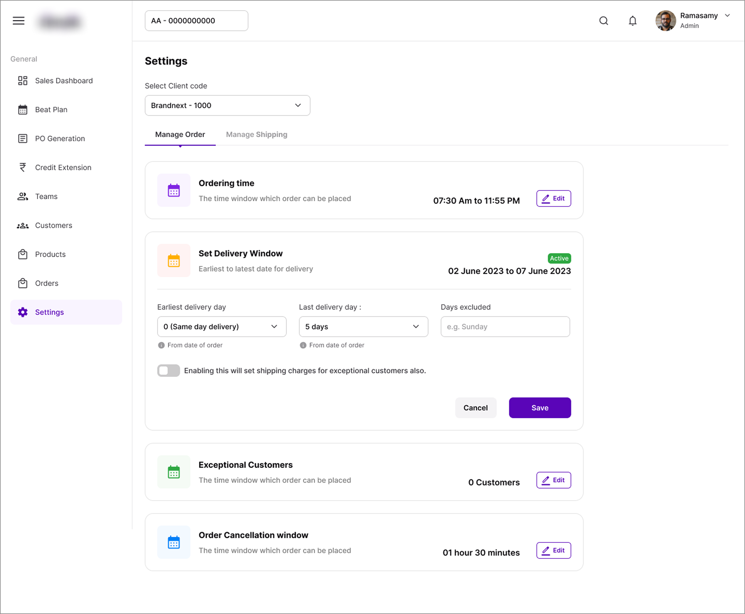
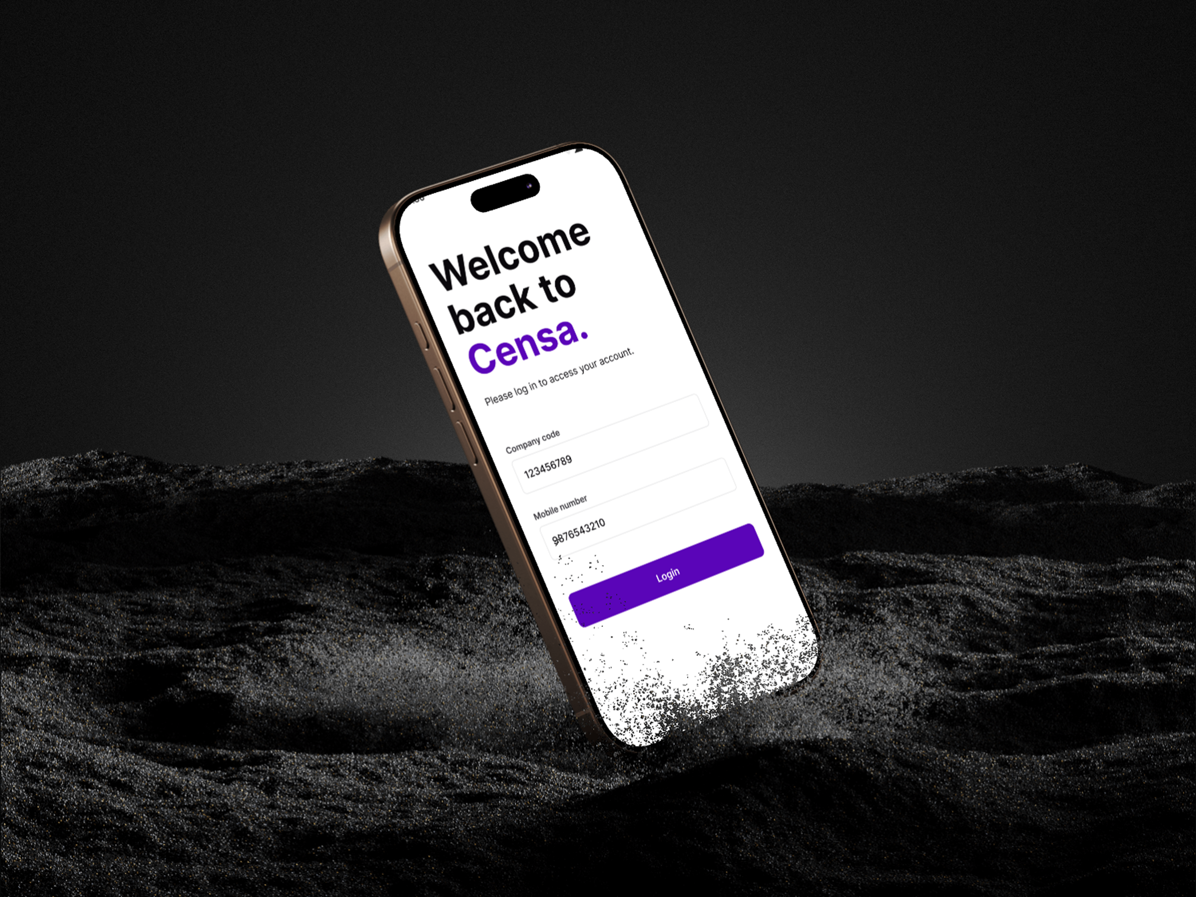
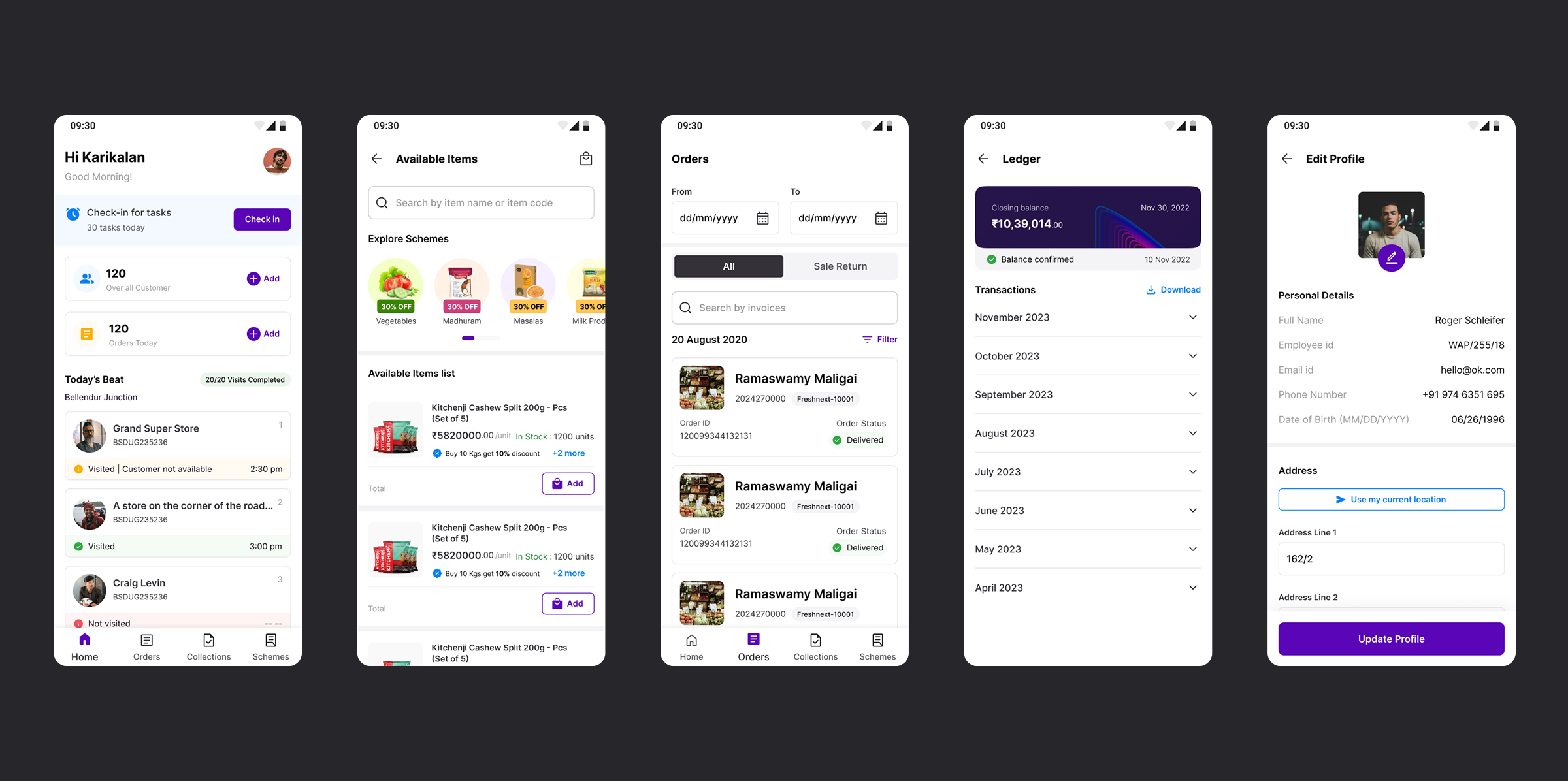
Colour: A single, disciplined palette built to scale — brand purple as the anchor, with accent colours (blue, yellow, green, red) reserved for status and data visualization across 14 products.
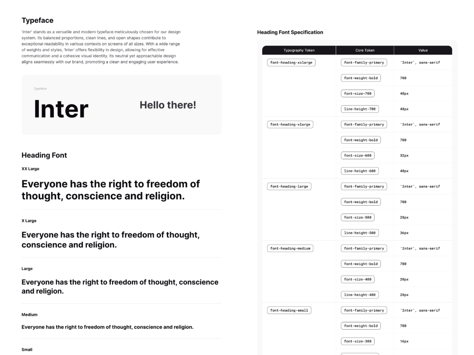
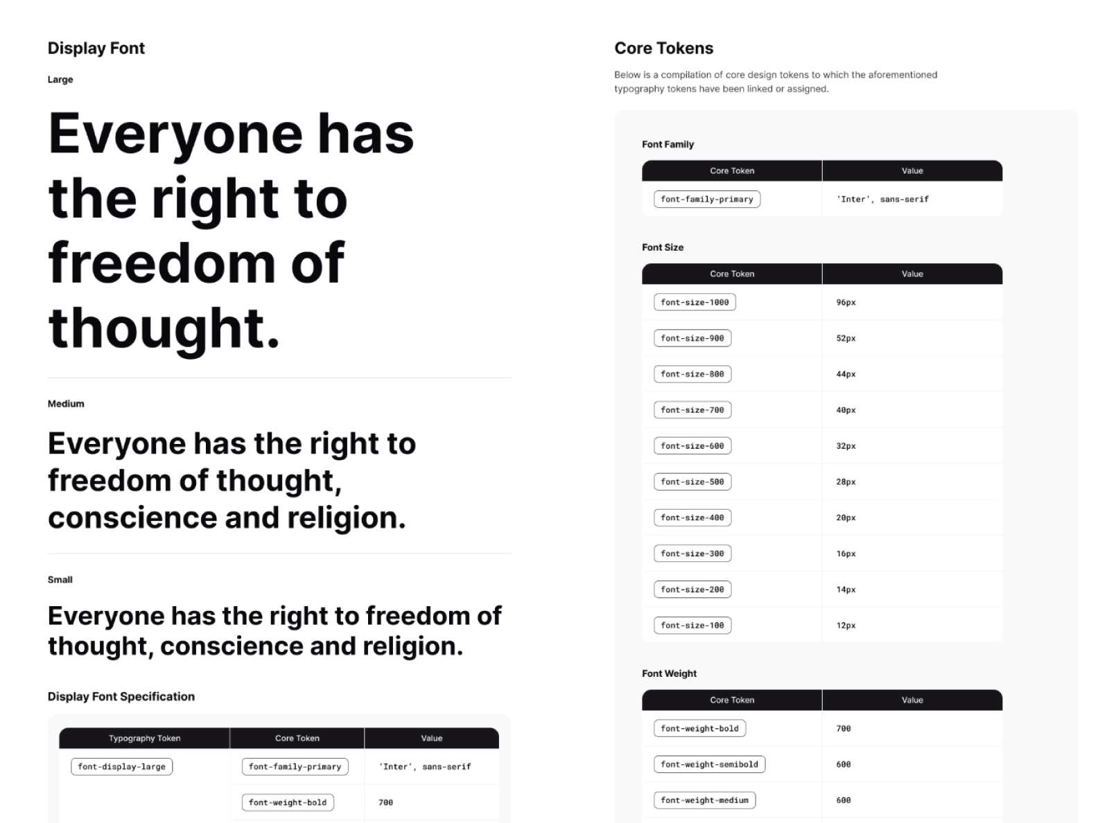
Typography: Inter across the system, with a clear type scale spanning Display, Heading, Body, and Label styles — each fully specified with size, weight, and line-height so nothing is left to interpretation.
Core Tokens: Colour, spacing, radius, and elevation values codified as reusable tokens — the foundation every component and product screen is built on.
30+ components, 200+ variants — covering everything from primitive elements (buttons, inputs, badges) to complex composite patterns (data tables, dashboards, navigation, forms) — all built to snap together consistently across any of the 14 products.
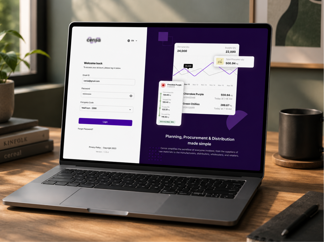
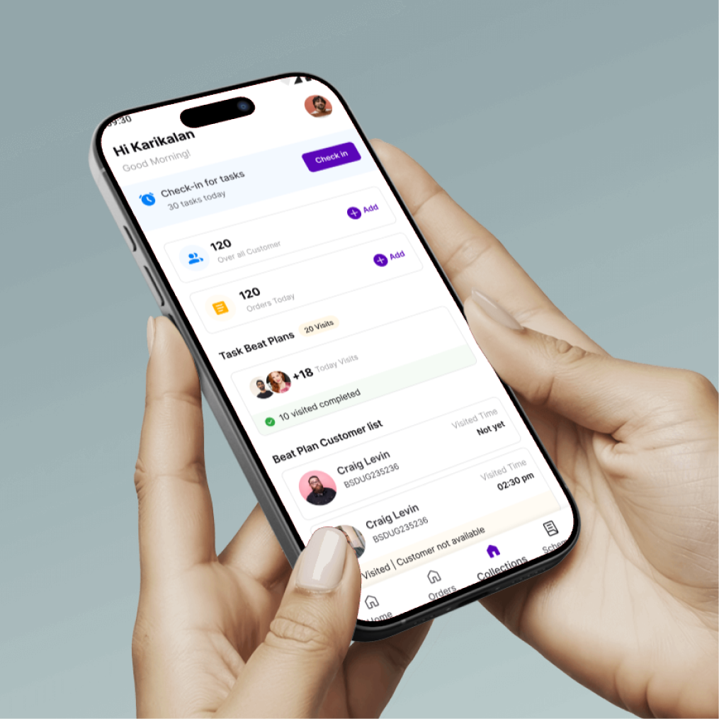
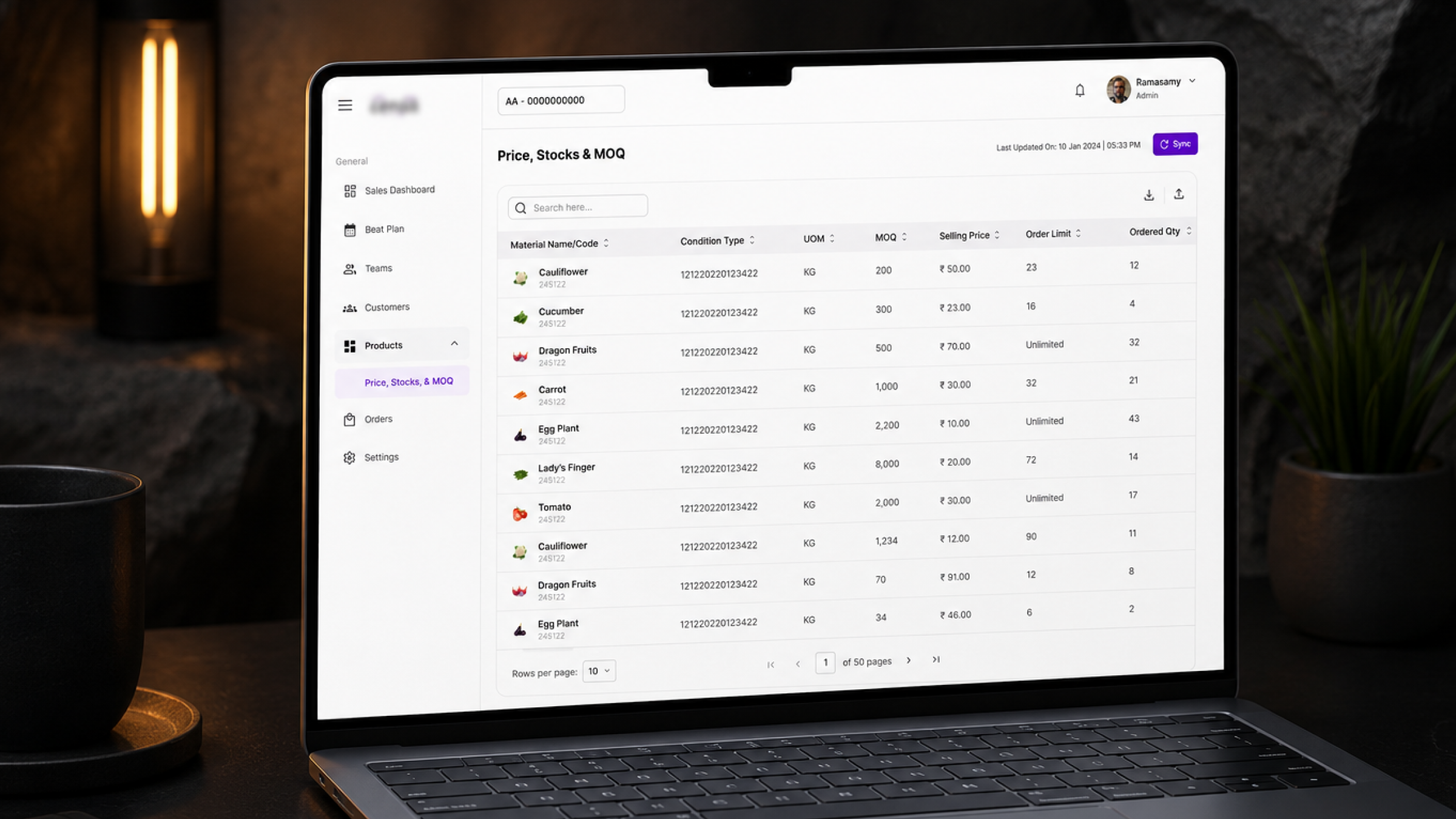
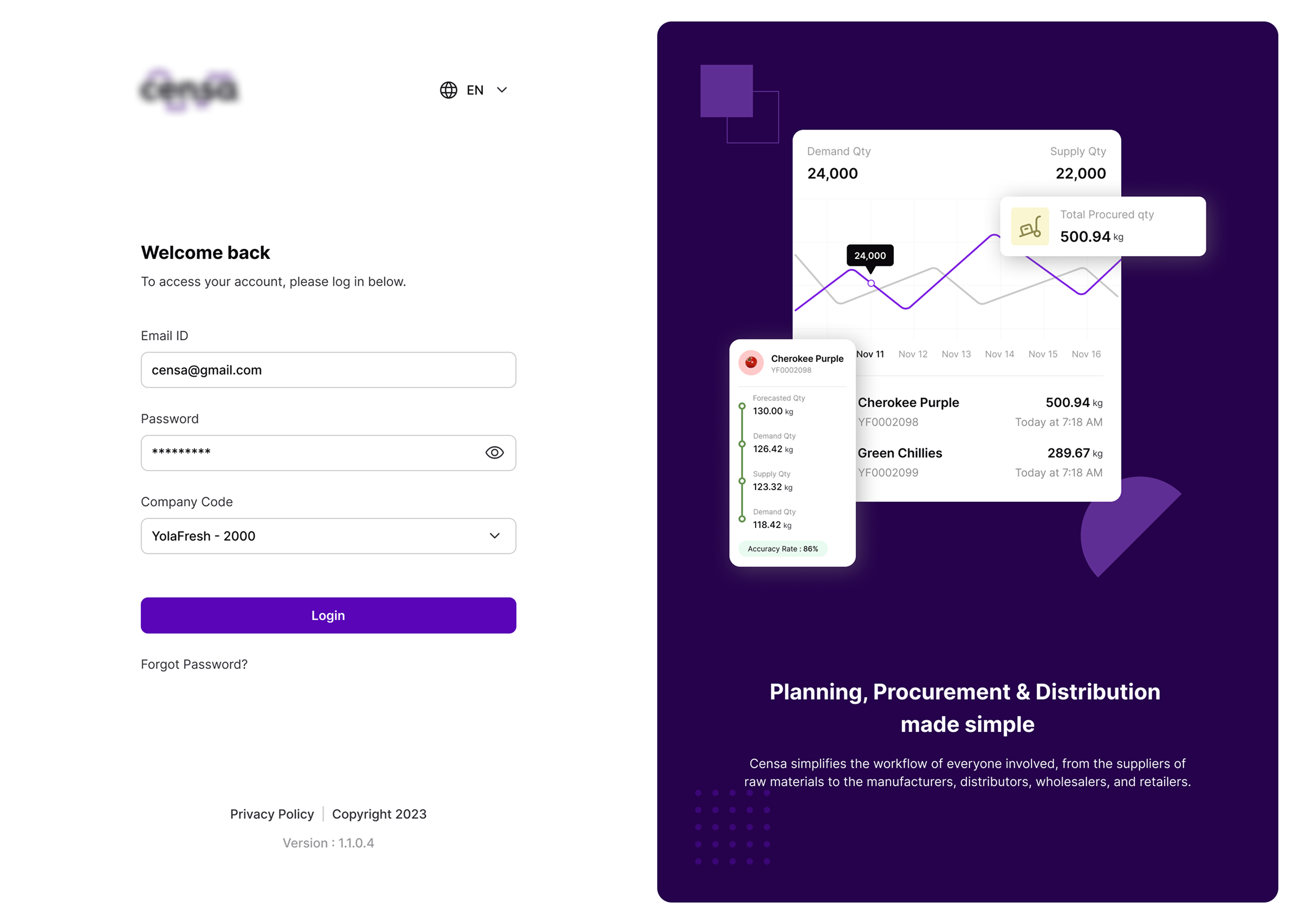
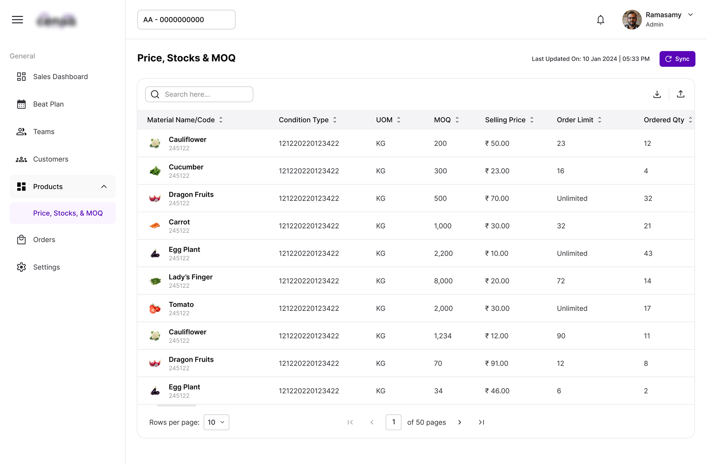
14 products unified under one design language — from planning and procurement to distribution.
30+ components / 200+ variants now shared across every team, eliminating redundant design and dev work.
Faster onboarding – new designers ship using the system instead of rebuilding fundamentals.
A scalable foundation – token-based architecture means future rebrands or theme updates cascade automatically instead of requiring a full redesign.
Thank you for exploring this work.