
Cisco for Startups (LaunchPad) is Cisco's global startup accelerator platform — connecting early-stage companies with mentors, investors, Cisco's technology stack, and go-to-market support to help them scale. The ecosystem spans startup onboarding, mentorship programs, investor connects, pilot programs, and partner enablement, all of which needed a digital home: a dashboard for the people running and participating in the program, and a public-facing website to bring in and showcase startups.
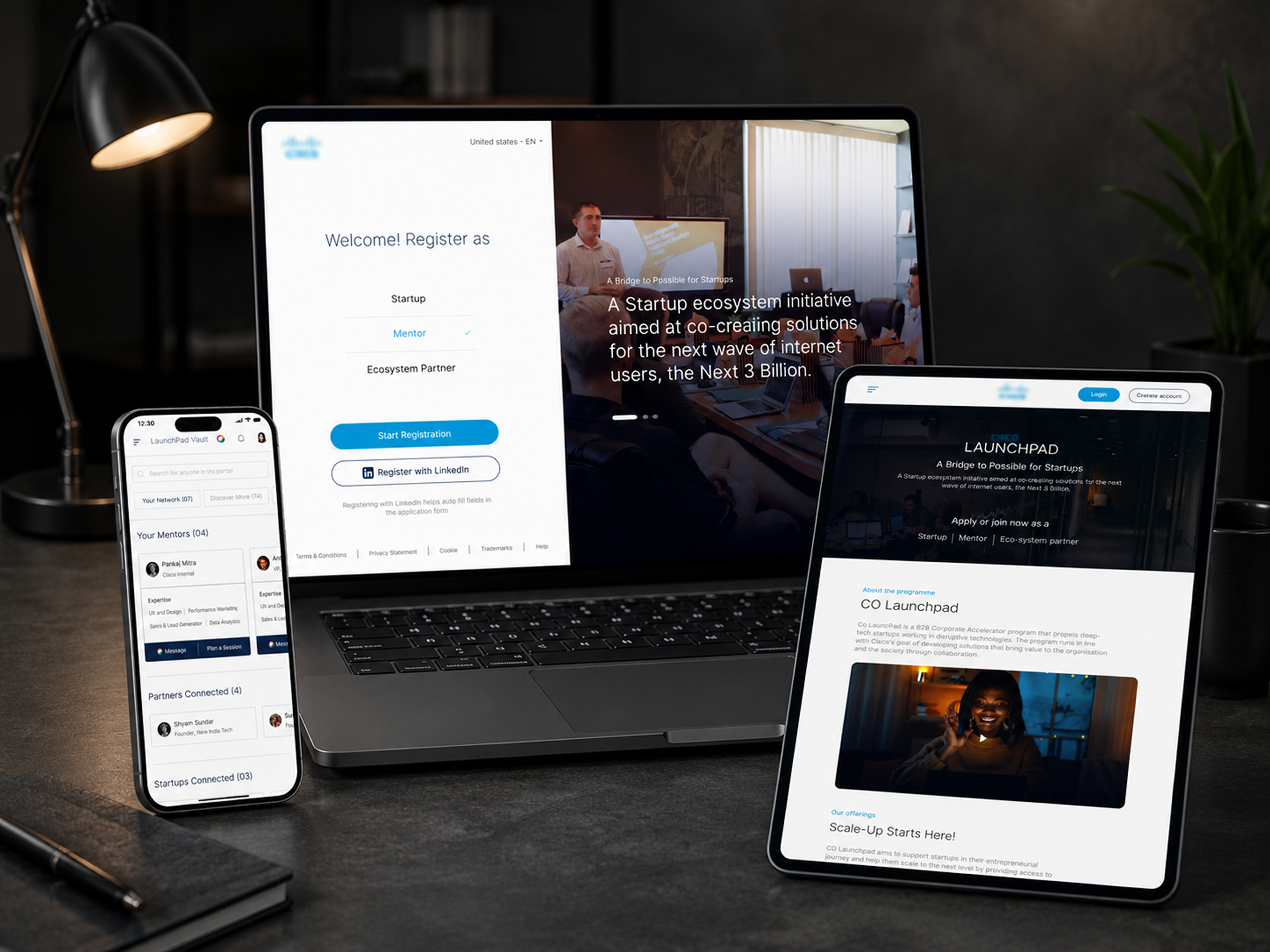
I worked as part of a design team delivering both surfaces — the internal dashboard and the external product/marketing website — each fully responsive across desktop, tablet, and mobile.
The client wanted a new, modern aesthetic for the platform — something that felt current and startup-facing, not enterprise and dated. The obstacle was Cisco's own design system.
Cisco's existing UI guidelines and component library were built for a different era of the brand — solid from a governance standpoint, but visually dated, and not built with the flexibility a modern, startup-facing product needed. Working strictly within those existing components would have meant shipping the same dated feel the client was explicitly trying to move away from.
So the challenge wasn't just "design a modern dashboard and website" — it was "modernise the experience while staying inside Cisco's brand guardrails," with no room to simply ignore brand and start from a blank slate.
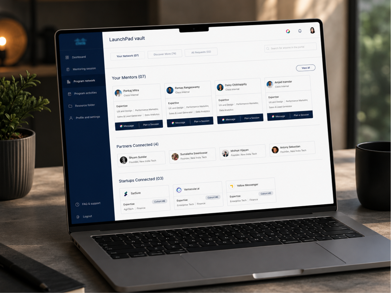
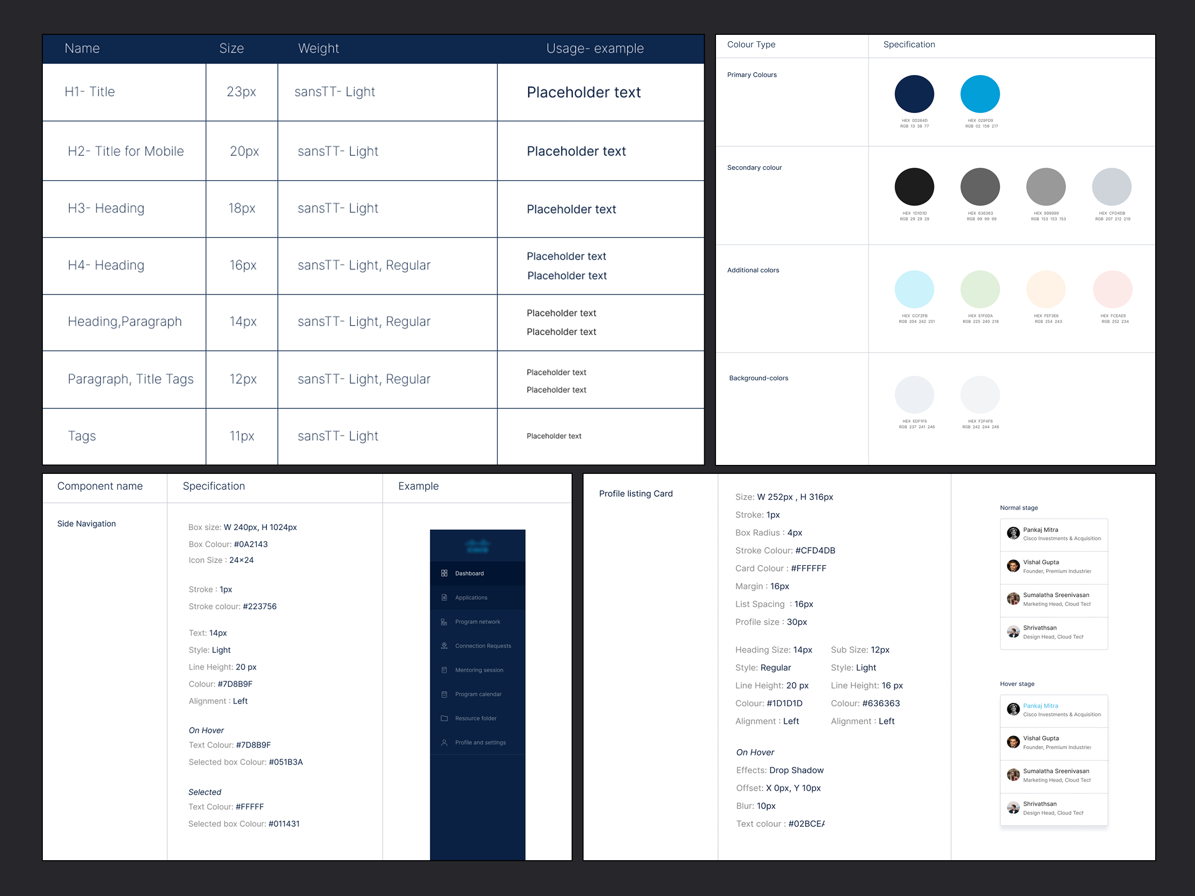
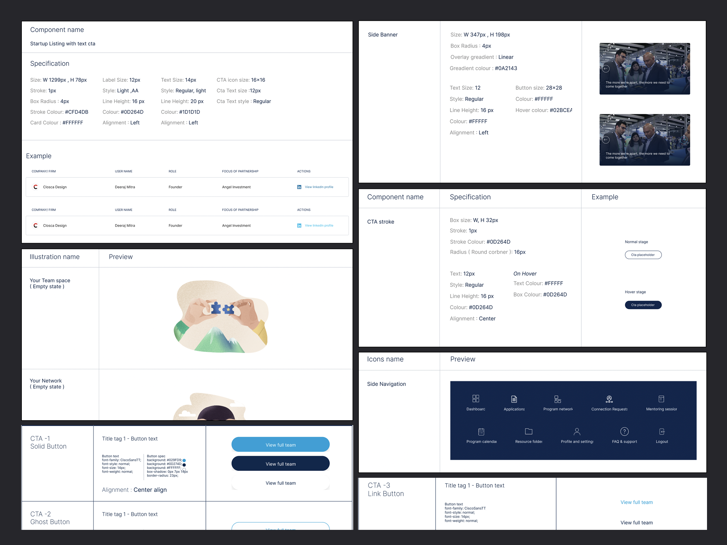
1. Built a new style guide, grounded in Cisco's brand. Rather than reusing the legacy component library as-is, I created a complete new style guide for the product — pulling core brand fundamentals (colour, typography, logo usage) directly from Cisco's brand guidelines, but rebuilding the components themselves to feel current: cleaner spacing, modern card and data patterns, and interaction states suited to a product experience rather than a marketing template.
2. Got sign-off before building product. Because this style guide was effectively setting a new visual direction on top of an established enterprise brand, it went through a stakeholder approval process before any dashboard or website screens were built — de-risking the rest of the project and giving the team a shared, agreed foundation to design from.
3. Designed dashboard and website in parallel, responsive by default. With the style guide approved, we built out the two core surfaces — the internal dashboard and the public product/marketing website — designing for desktop, tablet, and mobile from the start rather than retrofitting responsiveness later.
A style guide built specifically for this product, using Cisco's brand colours and typography as the foundation, but modernized at the component level — buttons, cards, tables, navigation, and form patterns — to support a cleaner, more current product experience than Cisco's legacy UI kit allowed.
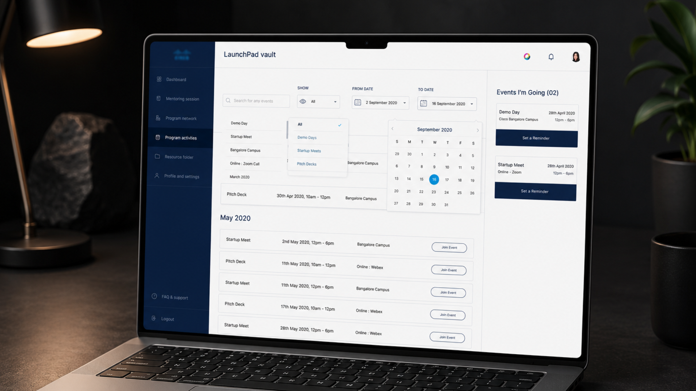
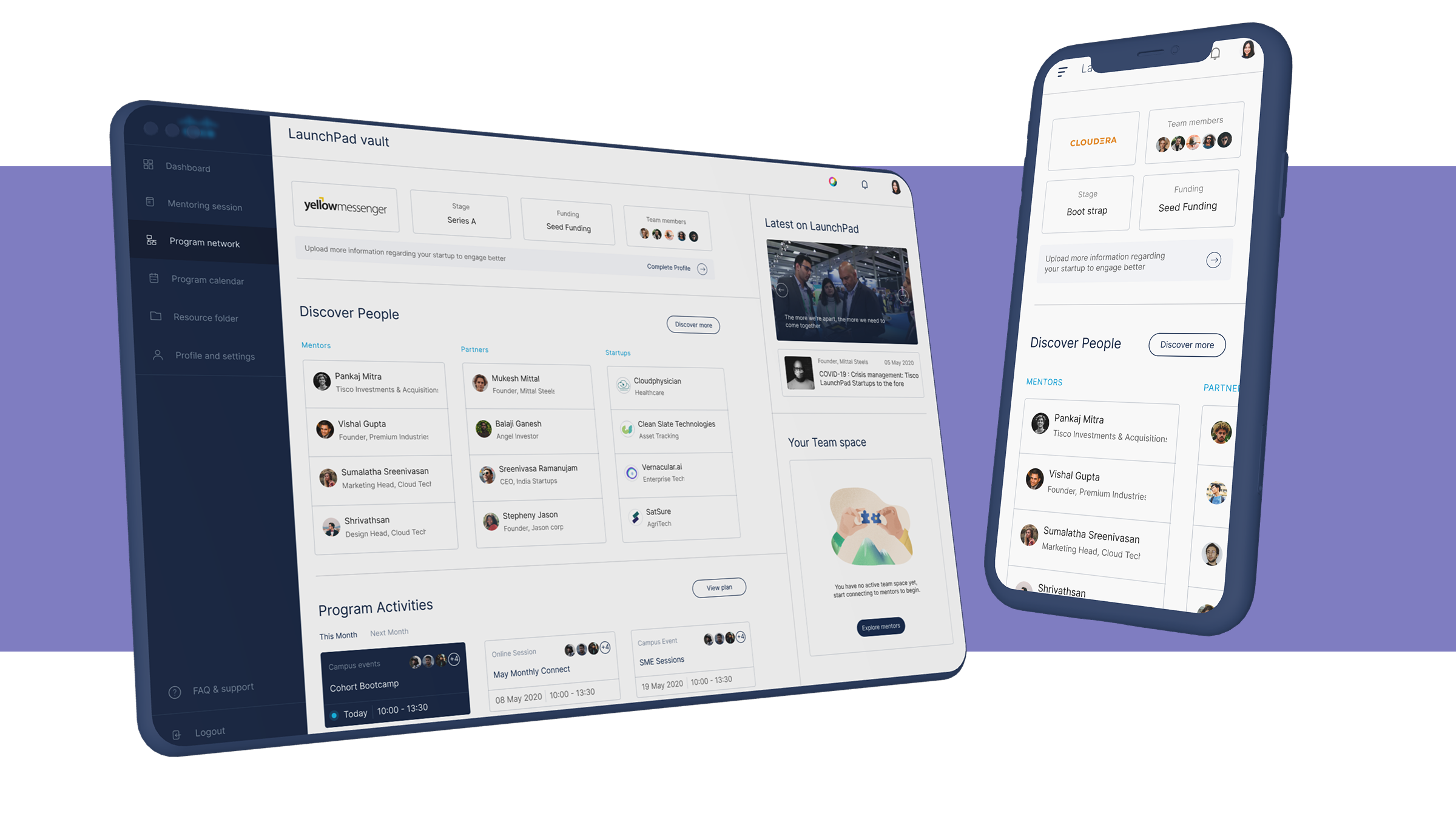
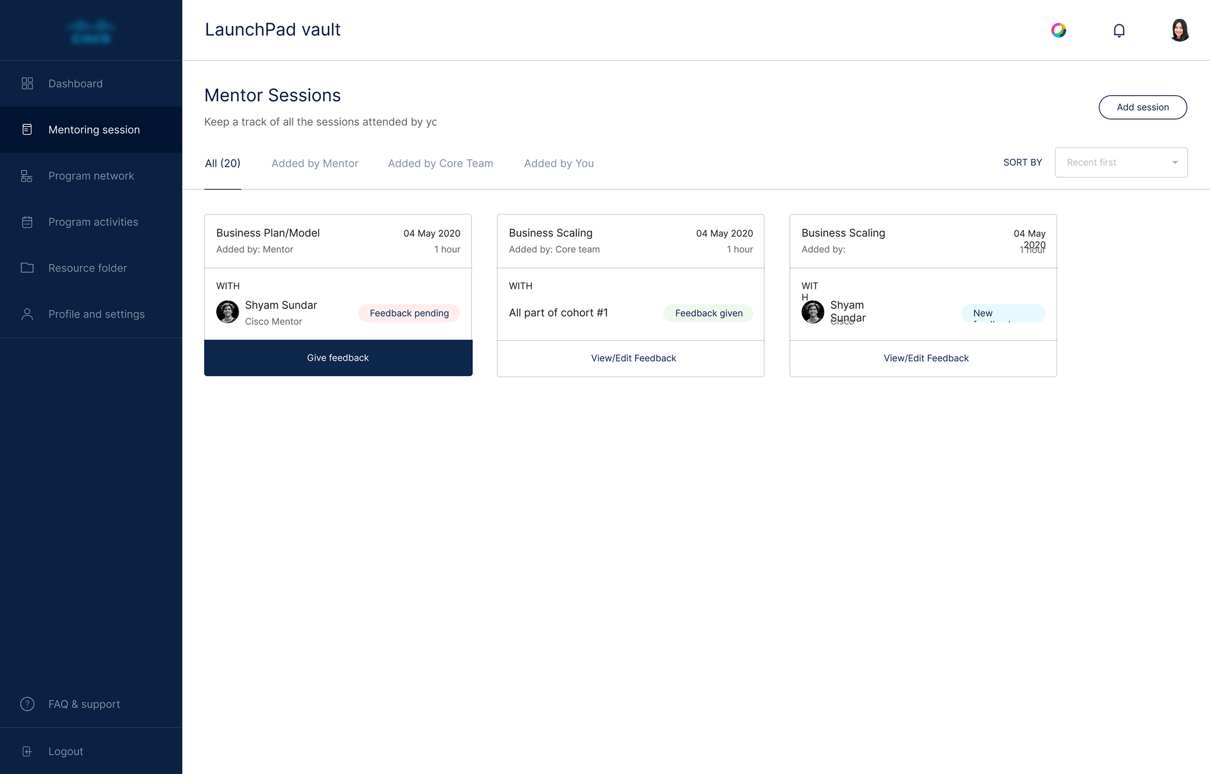
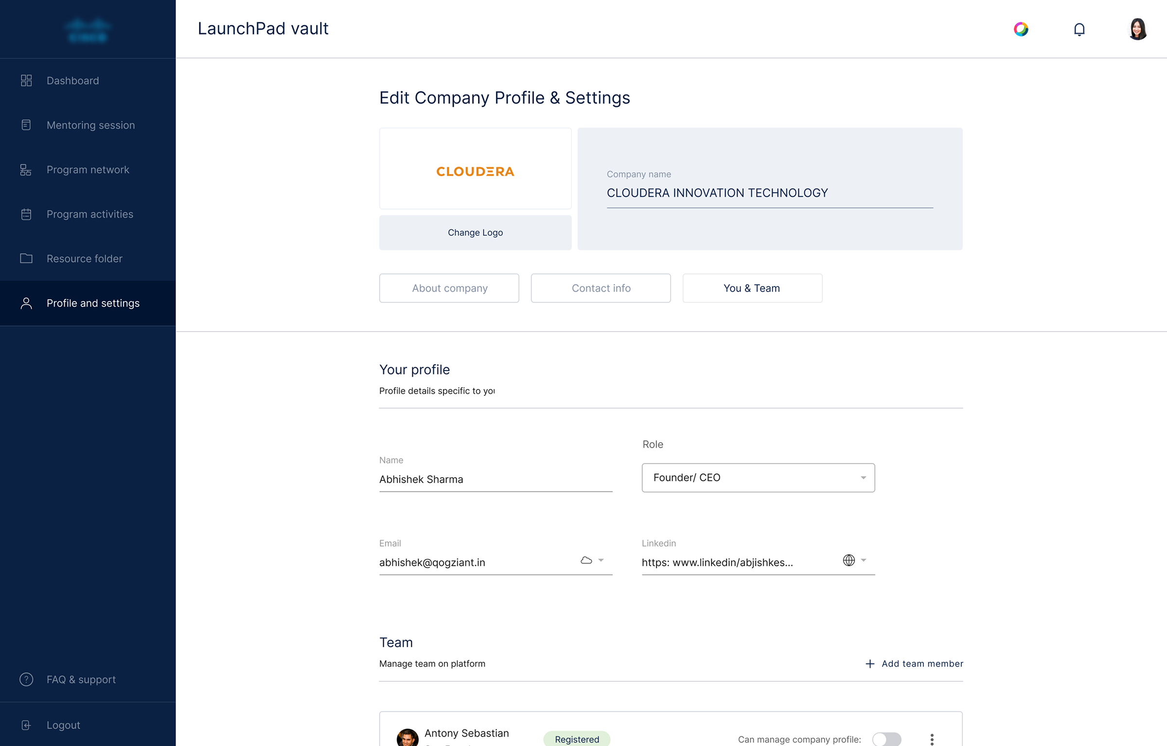
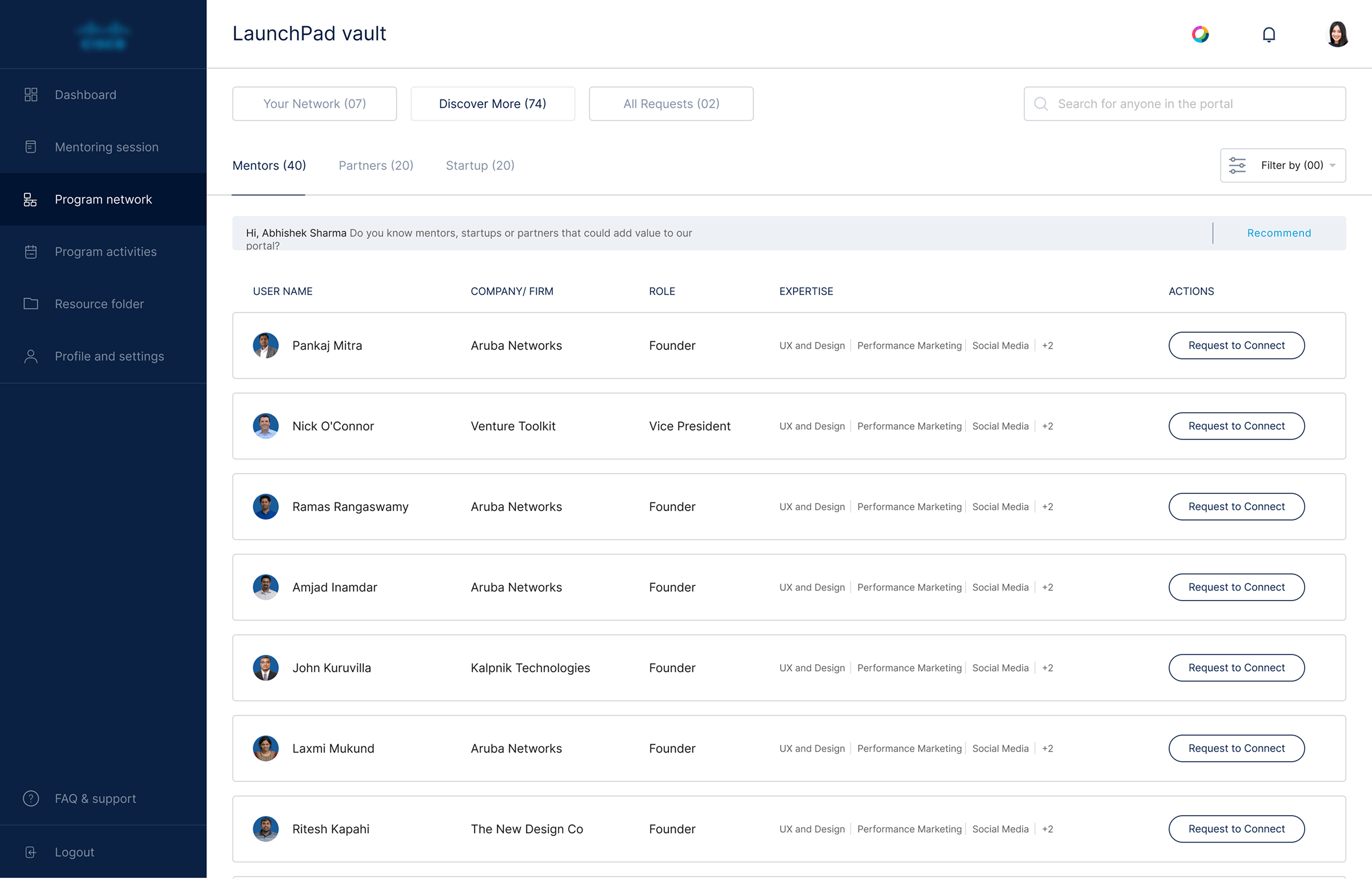
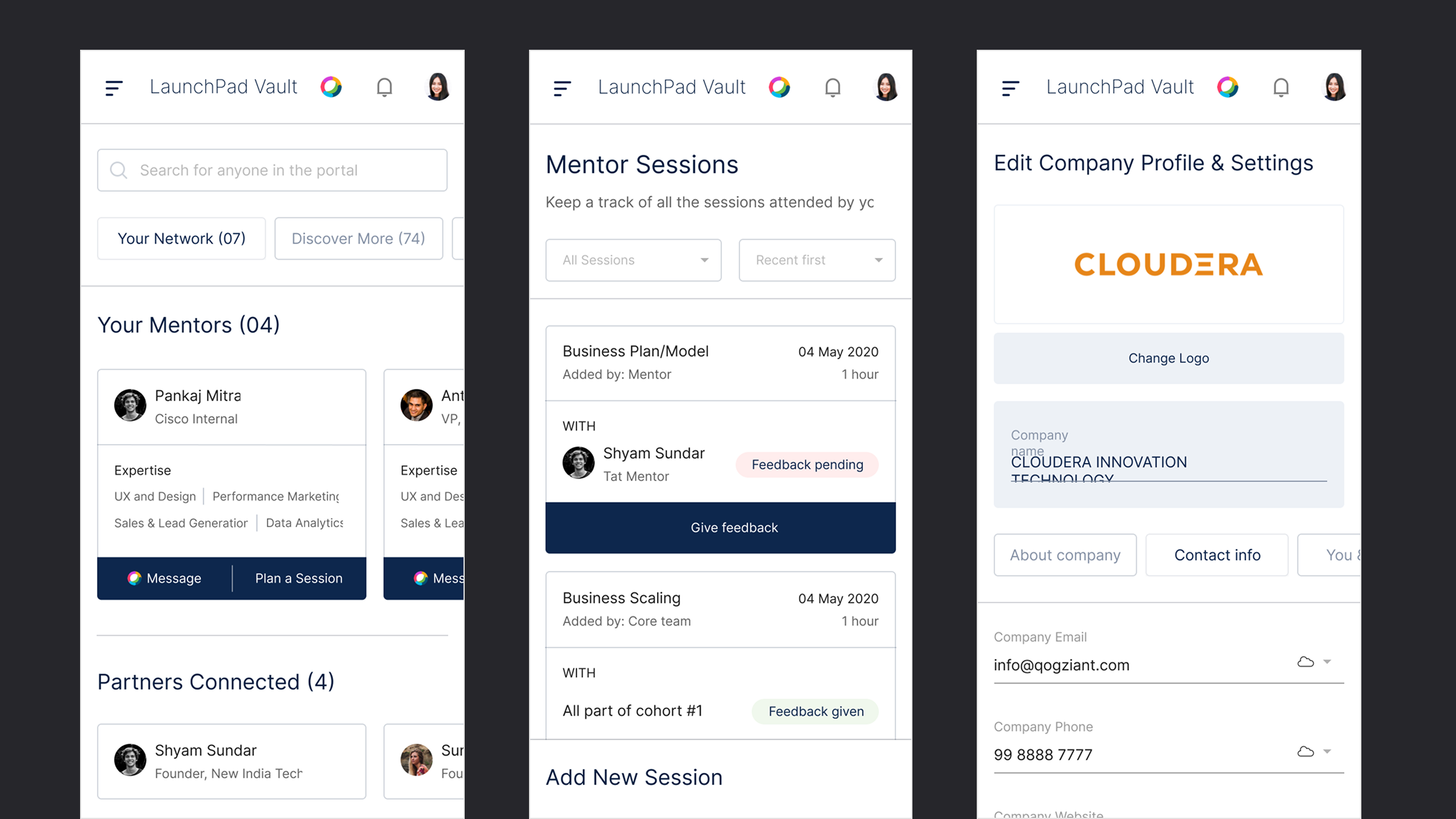
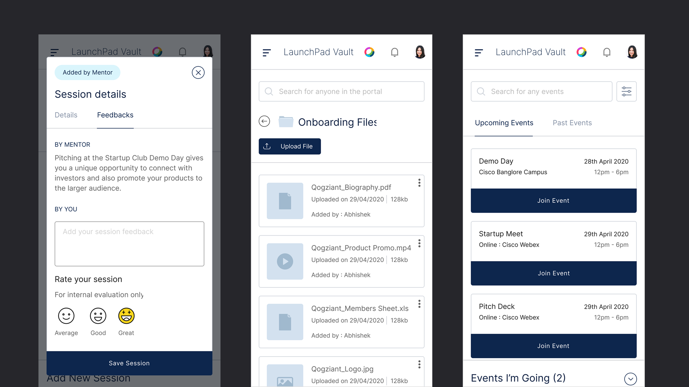
The dashboard is where the day-to-day of the accelerator program lives — tracking startups, mentors, sessions, and program activity in one place. Designed fully responsive, so program managers and mentors can use it as comfortably on a tablet as at a desk.
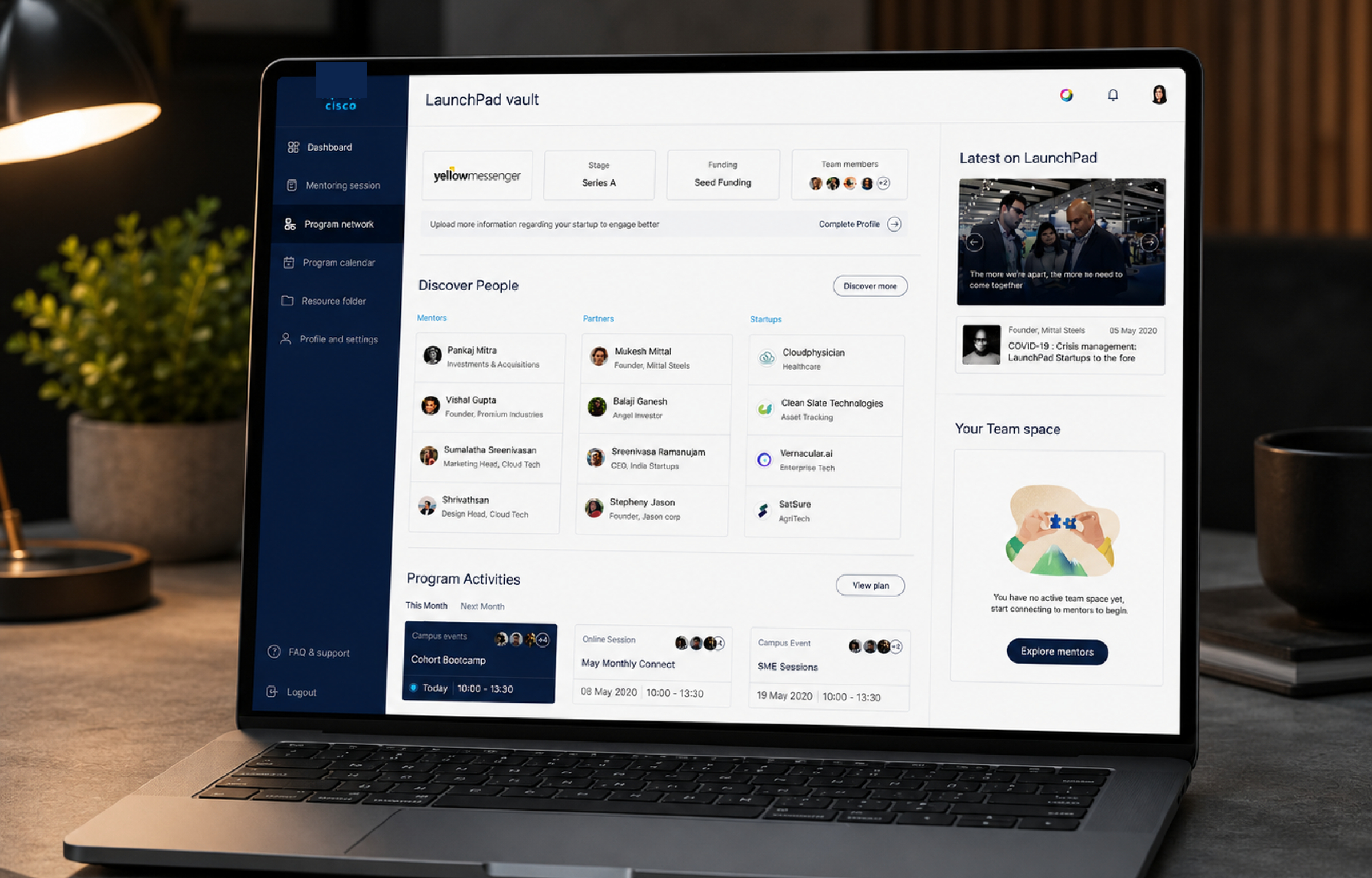
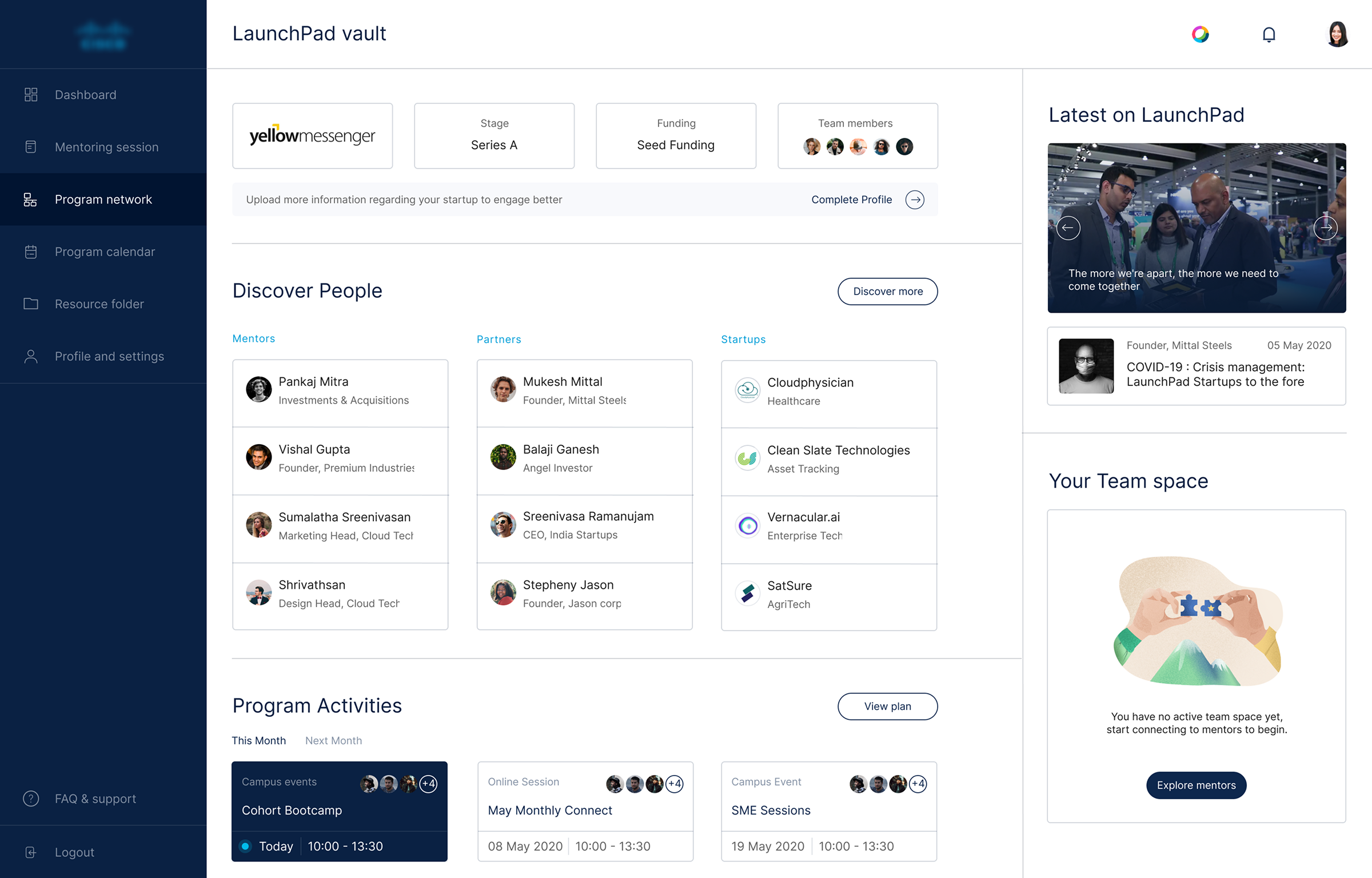
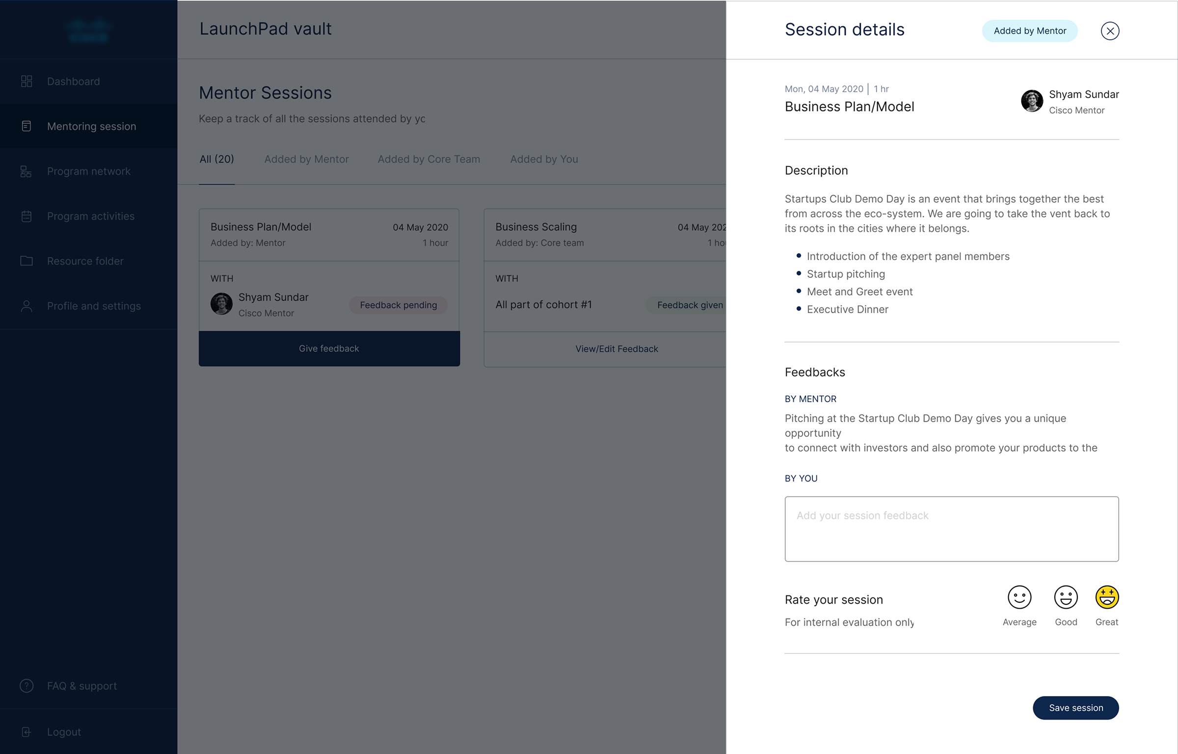
Every dashboard and website screen was designed to hold up on smaller viewports — not just reflowed, but reconsidered for touch and smaller screens.
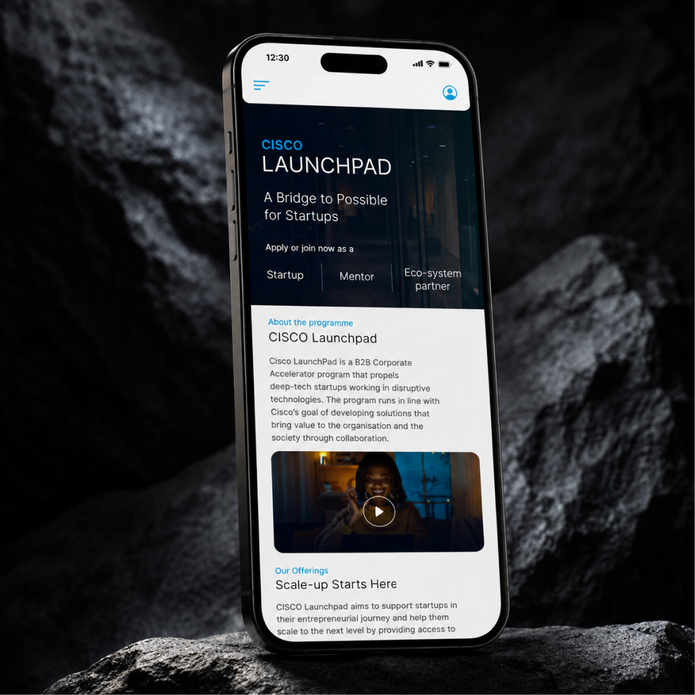
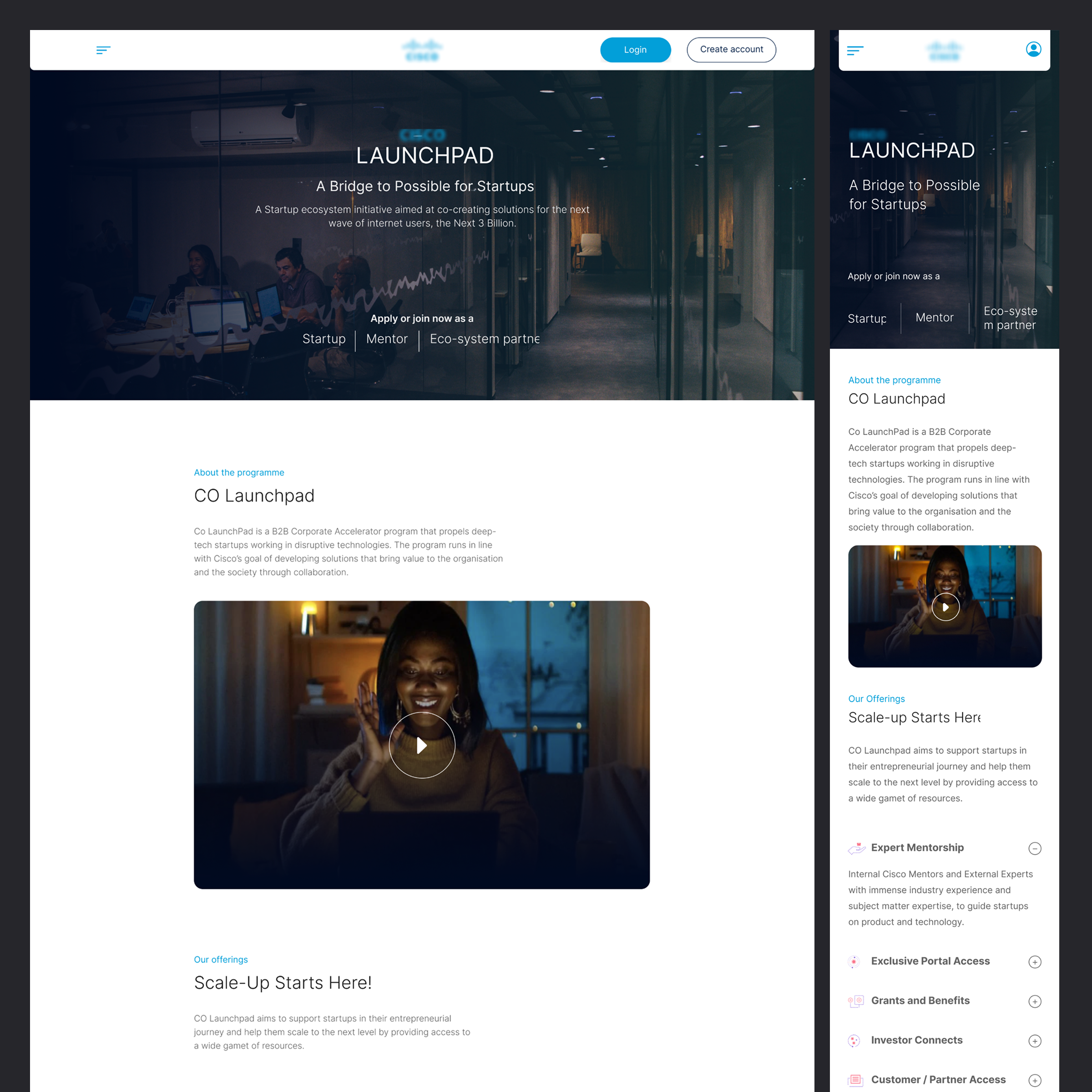
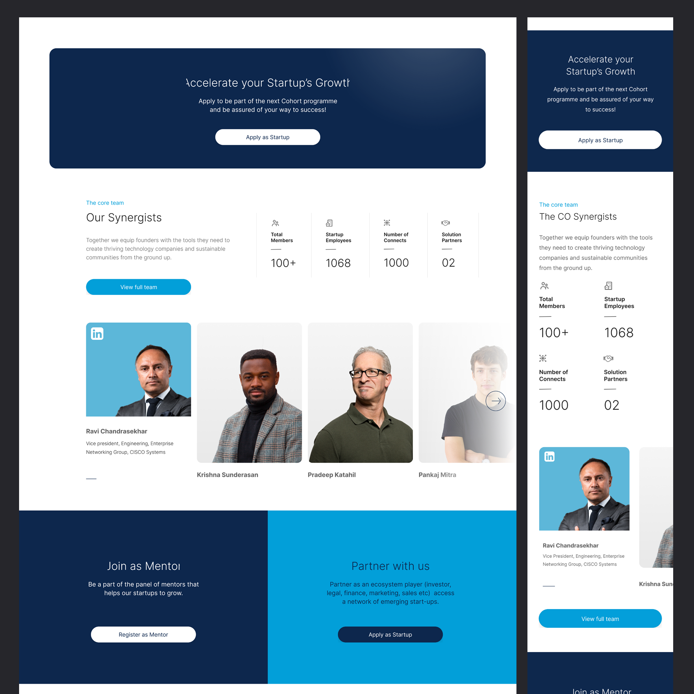
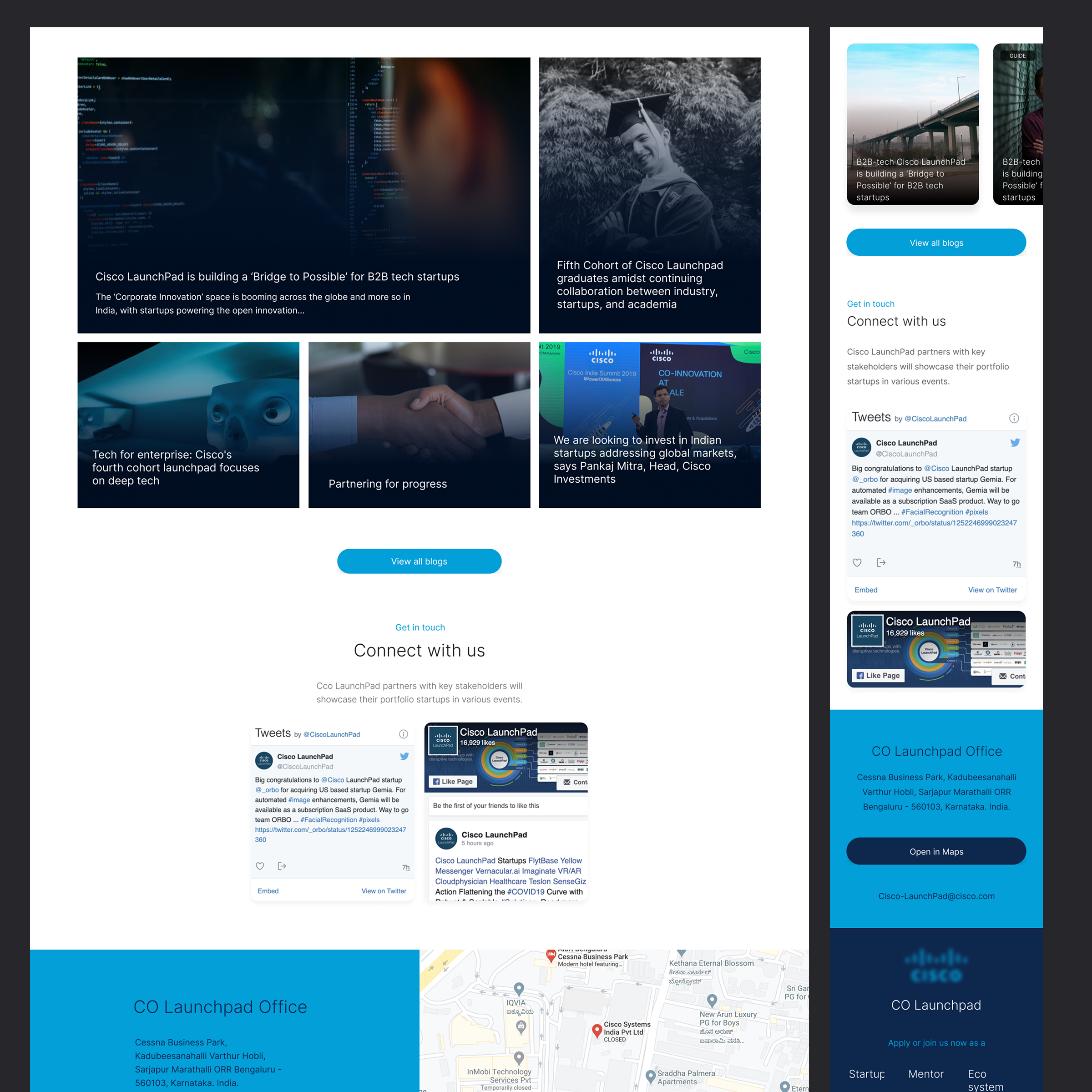
The public-facing site introduces the program to prospective startups, showcases the startup portfolio, and highlights the tech stack (Duo, Meraki, Webex, SD-WAN, and more), program outcomes, and success stories. Built using the new style guide to feel like a modern startup platform, while staying recognizably Cisco.
A modern visual identity, without breaking brand. The new style guide gave the product a current, startup-facing look while staying grounded in Cisco's brand colour and typography system.
Stakeholder-approved foundation. Getting the style guide signed off before production meant design and build moved with confidence, with no rework from late brand pushback.
Two fully responsive surfaces shipped. Both the dashboard and the marketing website work consistently across desktop, tablet, and mobile.
A reusable foundation. The style guide gives Cisco for Startups a modernised component base it can build future features on, rather than reverting to the legacy kit.
Thank you for exploring this work.